Selected work of
Design Portfolio 2026
Ray jones

Expertise: Student Designer
Introduction
I’m a graphic designer specialising in editorial, UX/UI and branding, with a focus on clear communication, considered typography and user-centred layouts. I enjoy shaping messy ideas into coherent visual systems and interfaces, drawing on my love of storytelling and world-building to create designs that feel both thoughtful and accessible. I’m looking to grow in junior UX/UI or multidisciplinary design roles where I can collaborate, keep learning, and contribute to meaningful digital experiences.
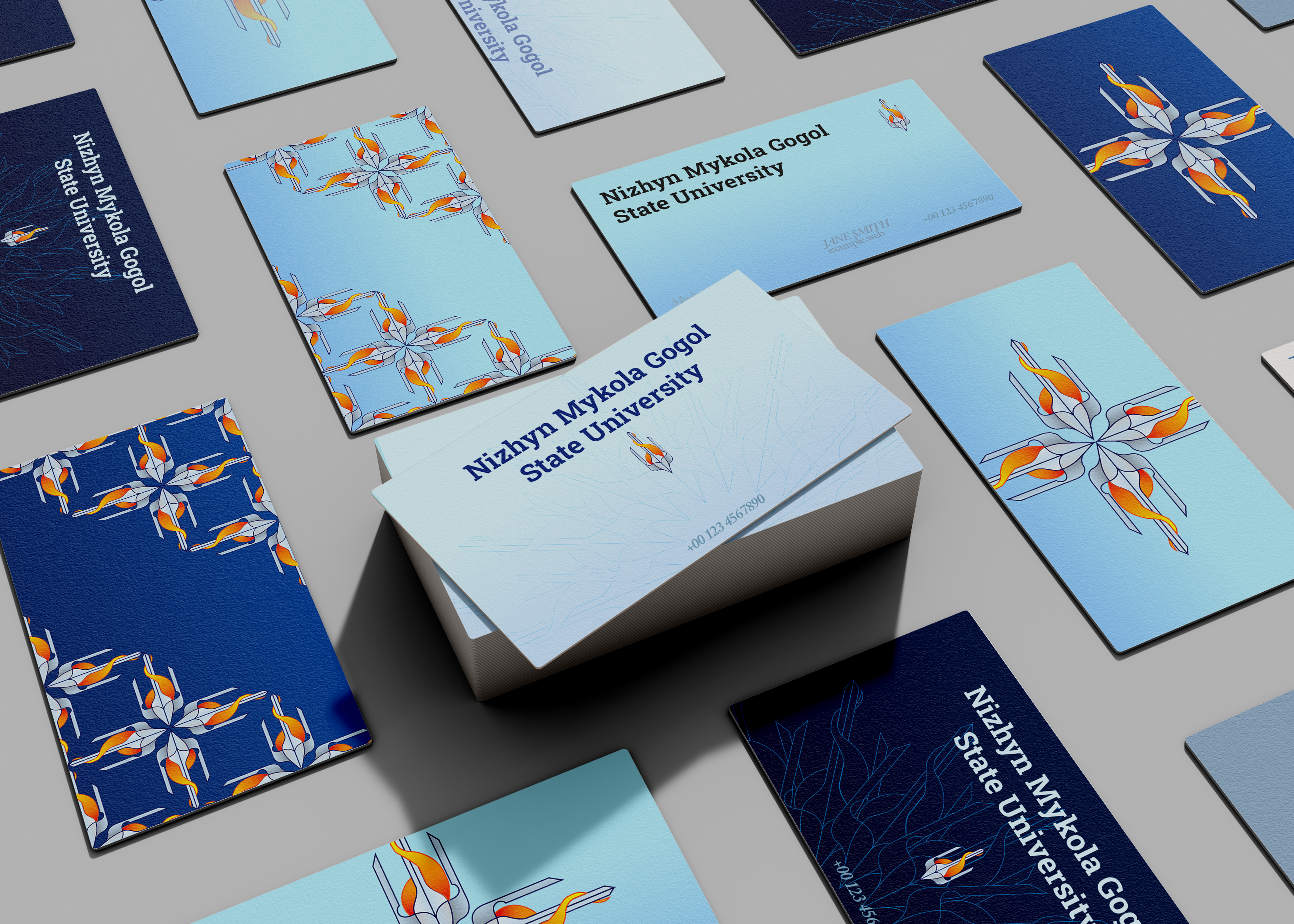
I led the creation of a refreshed visual identity for Nizhyn Mykola Gogol State University, blending its 220-year heritage with a modern, international outlook. The project strengthened my research into cultural context and global perspectives, refining my design process to be more empathetic and client-focused.
NMSGU rebrand
UX/UI Skills
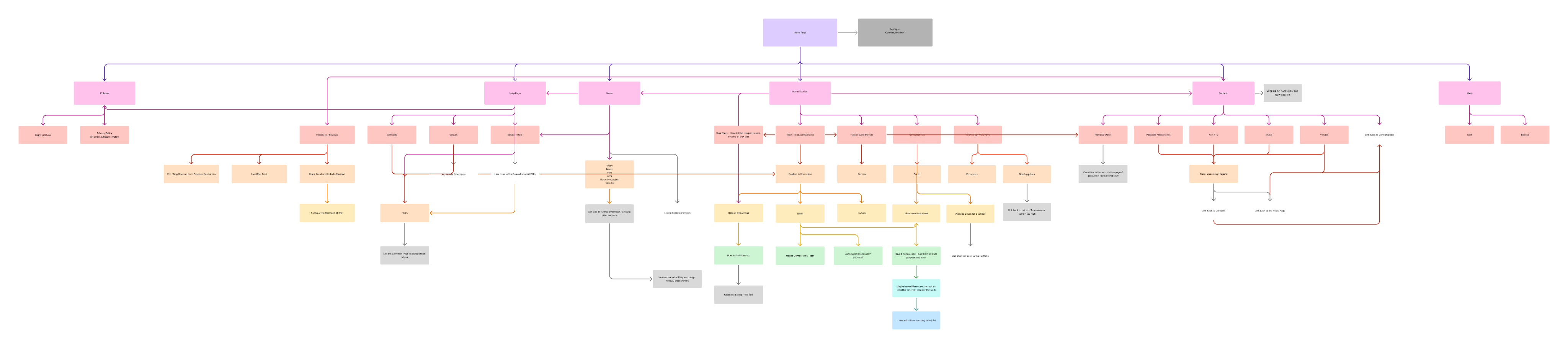
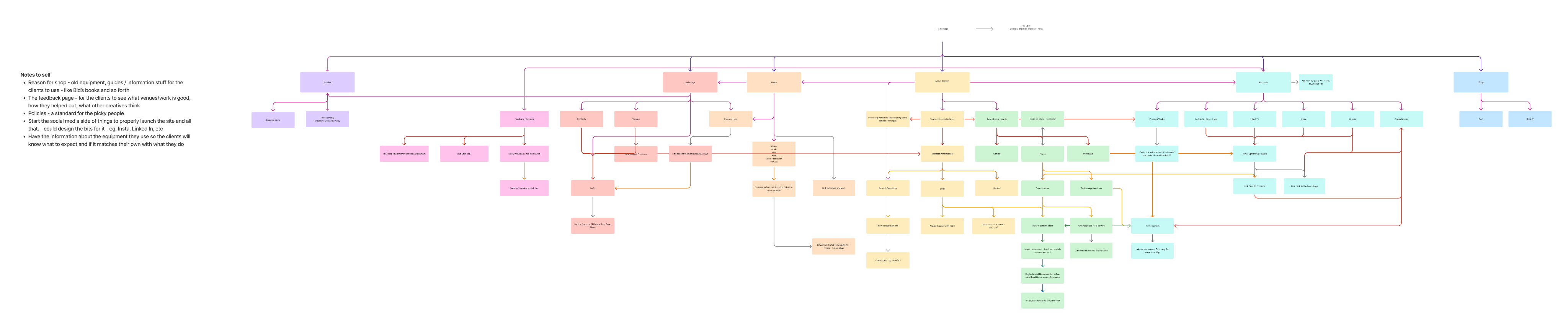
Download Generation was a second‑year UX project exploring how young people discover and consume music online. I began by mapping the site’s information architecture, defining key content areas, navigation labels, and pathways between discovery, listening, and saving. The site map helped clarify hierarchy early on and surfaced gaps in the structure before I moved into wireframes.
- Defined core sections around discovery, library, and profile.
- Mapped entry points from different devices and contexts.
- Used the map to prioritise navigation labels and content grouping.
- I personally had a lot of fun at this stage of the project and found the mapping rather easy to imagine and plan out.
I developed the concept and visual identity for a collaborative branding project led by the City of Wolverhampton Council and the University of Wolverhampton. I generated and tested ideas in Figma, refined concepts through agency critique, and pitched the final design to clients to drive awareness, engagement, and partnership opportunities to the brand and their mission.
Wolverhampton Green Innovation Corridor
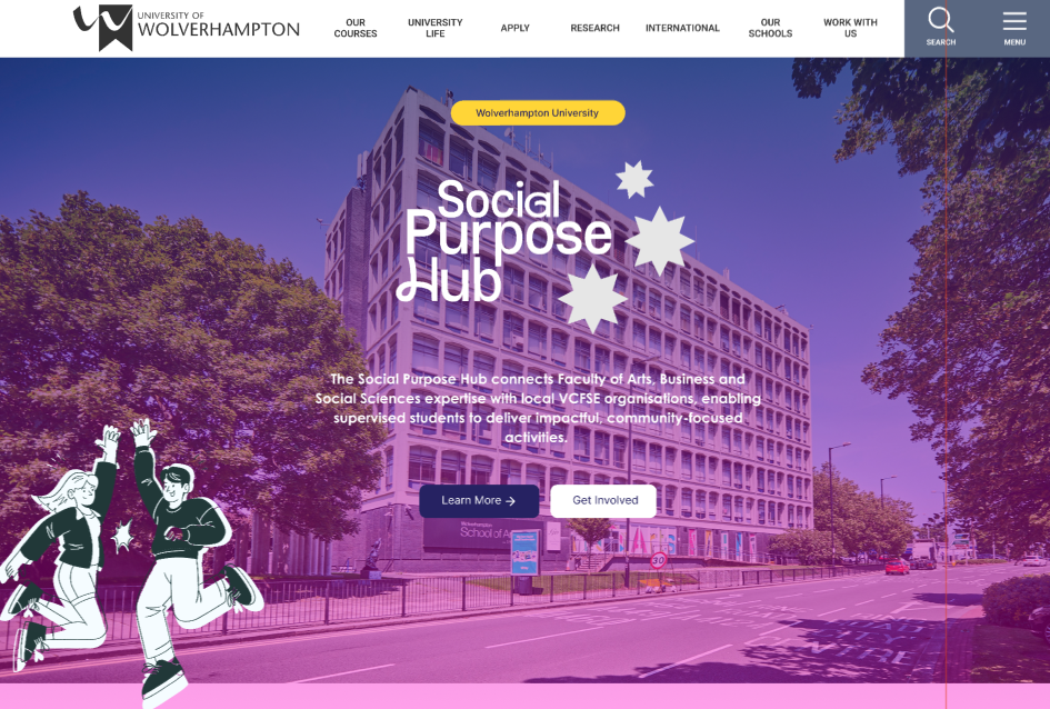
I led the website design for a collaborative sociology project, creating a clearer and more engaging platform to showcase the Hub’s connection with the university. My role included contributing to the full rebrand, designing promotional materials, and presenting the final work in a client-style critique with the student team.
Advocacy: Social Purpose Hub
Expertise: Student Designer
Nizhyn Mykola Gogol State University (NMGSU) is a historic Ukrainian institution seeking a refreshed identity that reflects both its heritage and its international outlook. My role was to develop a cohesive rebrand that honours local symbolism while feeling contemporary and scalable across print and digital touchpoints.
NMSGU rebrand
branding & UX
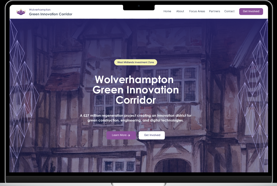
Green Innovation Corridor is a proposed investment zone for sustainable construction, engineering, and digital industries. The brief was to create a visual identity that feels professional and future‑facing without leaning on clichéd ‘green’ aesthetics.
GREEN INNOVATION CORRIDOR
branding & STRATEGY
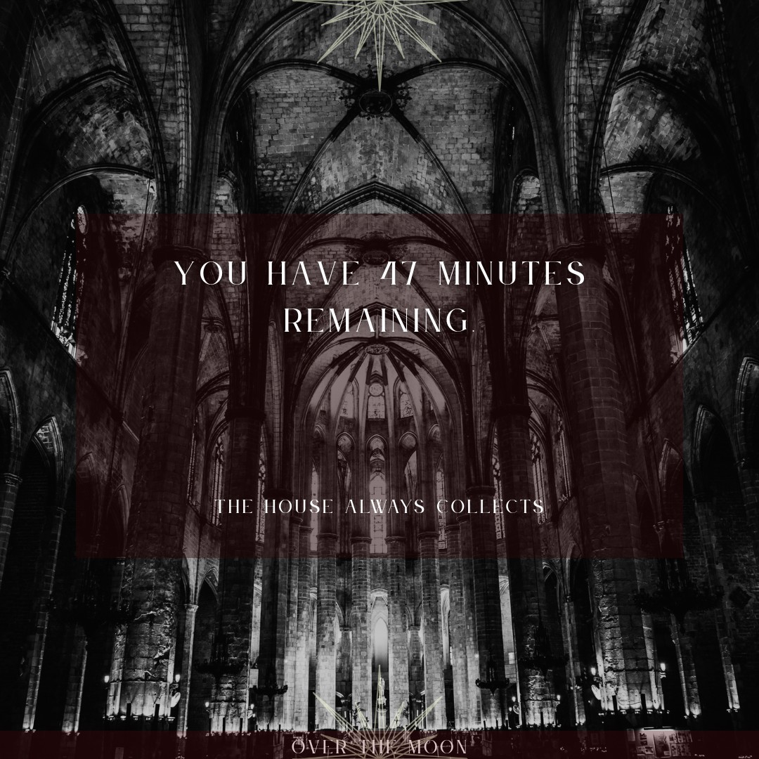
Over the Moon is a speculative afterlife pub brand where time, not money, is the main currency. My role was to develop the brand identity and translate its narrative into a functioning website, balancing theatrical storytelling with clear UX.
OVER THE MOON
branding, EDITORIAL, 3D AND UX/UI
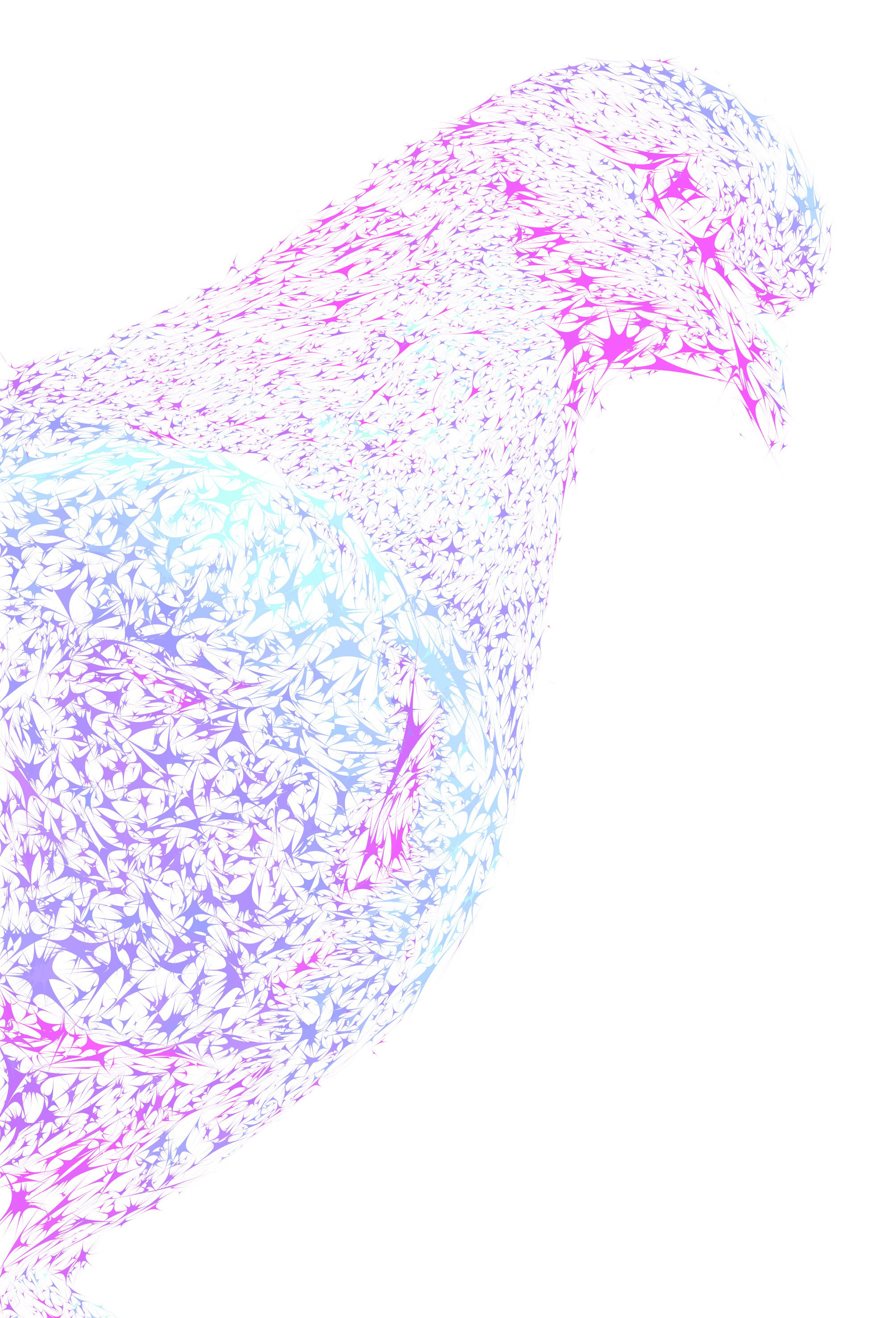
Pigeon is a collaboratively produced lifestyle magazine celebrating creative industries in Wolverhampton and the Black Country. I worked as both a lead and contributing designer, responsible for setting and following a shared visual system across multiple issues and spreads.
pIGEON mAGAZINE
EDITORIAL & ART DIRECTION
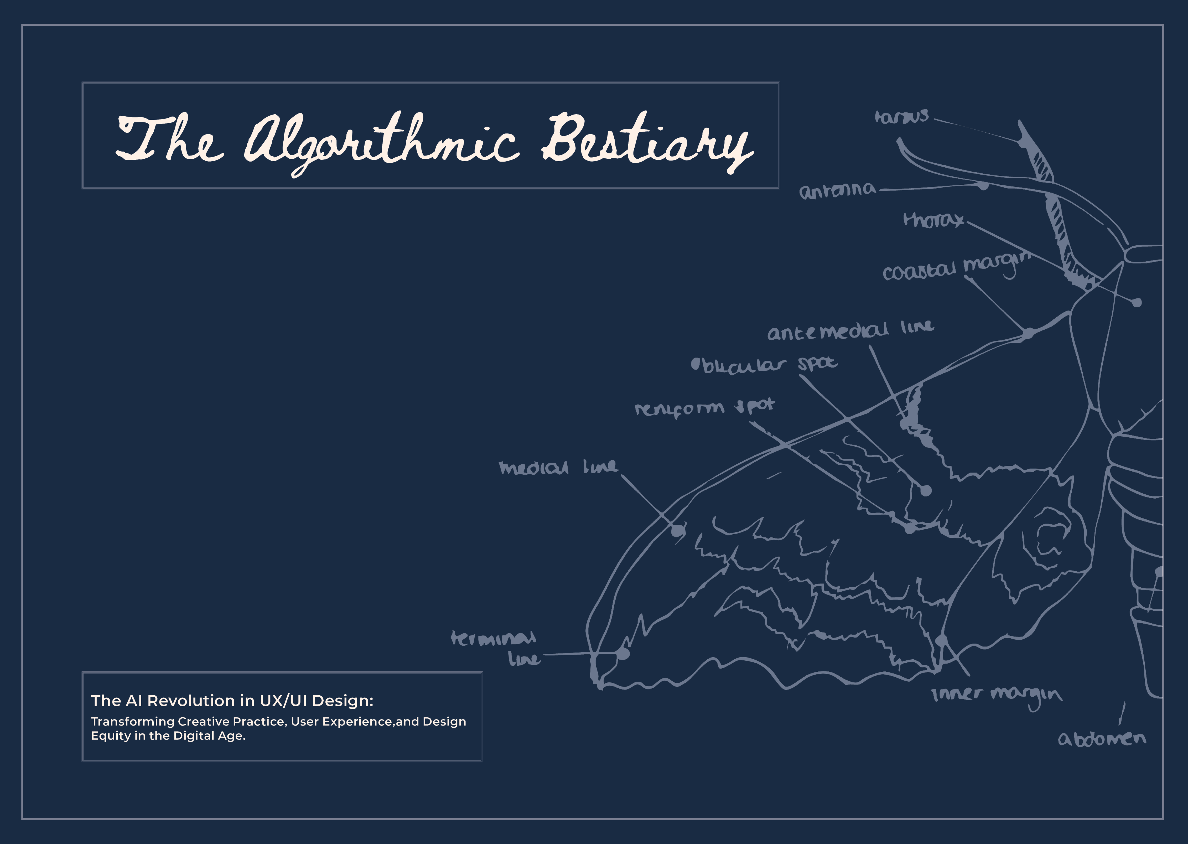
My thesis, “The AI Revolution in UX/UI Design: Transforming Creative Practice, User Experience, and Design Equity in the Digital Age,” investigated how artificial intelligence is reshaping UX/UI design. It examined AI’s creative potential, professional and ethical implications, and the evolving relationship between automation, accessibility, and design authorship.
VISUAL THESIS
EDITORIAL & RESEARCH
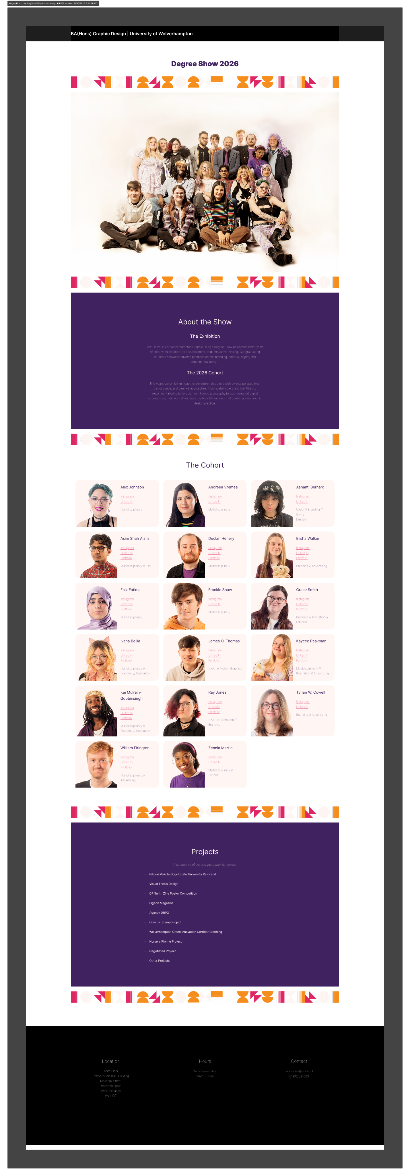
A collaboratively developed WordPress website designed to showcase the degree show through a cohesive, accessible, and professionally curated digital catalogue of student work.
DEGREE SHOW WEBSITE
LEARNING & UX/UI
Selected work of
Ray Jones
Design Portfolio 2026
Introduction
I’m a graphic designer specialising in editorial, UX/UI and branding, with a focus on clear communication, considered typography and user-centred layouts. I enjoy shaping messy ideas into coherent visual systems and interfaces, drawing on my love of storytelling and world-building to create designs that feel both thoughtful and accessible. I’m looking to grow in junior UX/UI or multidisciplinary design roles where I can collaborate, keep learning, and contribute to meaningful digital experiences.
Expertise
I led the creation of a refreshed visual identity for Nizhyn Mykola Gogol State University, blending its 220-year heritage with a modern, international outlook. The project strengthened my research into cultural context and global perspectives, refining my design process to be more empathetic and client-focused.
Student Designer - NMSGU rebrand
I developed the concept and visual identity for a collaborative branding project led by the City of Wolverhampton Council and the University of Wolverhampton. I generated and tested ideas in Figma, refined concepts through agency critique, and pitched the final design to clients to drive awareness, engagement, and partnership opportunities to the brand and their mission.
Student Designer - Wolverhampton GIC
I led the website design for a collaborative sociology project, creating a clearer and more engaging platform to showcase the Hub’s connection with the university. My role included contributing to the full rebrand, designing promotional materials, and presenting the final work in a client-style critique with the student team.
Student Designer - Advocacy in Action
Projects
ReBrand & UX
Nizhyn Mykola Gogol State University (NMGSU) is a historic Ukrainian institution seeking a refreshed identity that reflects both its heritage and its international outlook. My role was to develop a cohesive rebrand that honours local symbolism while feeling contemporary and scalable across print and digital touchpoints.
Nizhyn Mykola Gogol State University
ReBrand & Strategy
Green Innovation Corridor is a proposed investment zone for sustainable construction, engineering, and digital industries. The brief was to create a visual identity that feels professional and future‑facing without leaning on clichéd ‘green’ aesthetics.
Wolverhampton Green Innovation Corridor (GIC)
Branding, UX/UI & 3D
Over the Moon is a speculative afterlife pub brand where time, not money, is the main currency. My role was to develop the brand identity and translate its narrative into a functioning website, balancing theatrical storytelling with clear UX.
Rhyme Project:
Over the Moon
Editorial & Art direction
Pigeon is a collaboratively produced lifestyle magazine celebrating creative industries in Wolverhampton and the Black Country. I worked as both a lead and contributing designer, responsible for setting and following a shared visual system across multiple issues and spreads.
Pigeon Magazine:Issue 31
Research & Editorial
My thesis, “The AI Revolution in UX/UI Design: Transforming Creative Practice, User Experience, and Design Equity in the Digital Age,” investigated how artificial intelligence is reshaping UX/UI design. It examined AI’s creative potential, professional and ethical implications, and the evolving relationship between automation, accessibility, and design authorship.
Visual Thesis:Design
LEARNING & UX/UI
A collaboratively developed WordPress website designed to showcase the degree show through a cohesive, accessible, and professionally curated digital catalogue of student work.
Degree Show Website
UX/UI Methods
Download Generation was a second‑year UX project exploring how young people discover and consume music online. I began by mapping the site’s information architecture, defining key content areas, navigation labels, and pathways between discovery, listening, and saving. The site map helped clarify hierarchy early on and surfaced gaps in the structure before I moved into wireframes.
- Defined core sections around discovery, library, and profile.
- Mapped entry points from different devices and contexts.
- Used the map to prioritise navigation labels and content grouping.
I personally had a lot of fun at this stage of the project and found the mapping rather easy to imagine and plan out.
Download Generation Site Maps & User Journeys