Branding, UX/UI & 3D
OVER THE MOON
Over the Moon is a speculative afterlife pub brand where time, not money, is the main currency. My role was to develop the brand identity and translate its narrative into a functioning website, balancing theatrical storytelling with clear UX.
Research & Concept
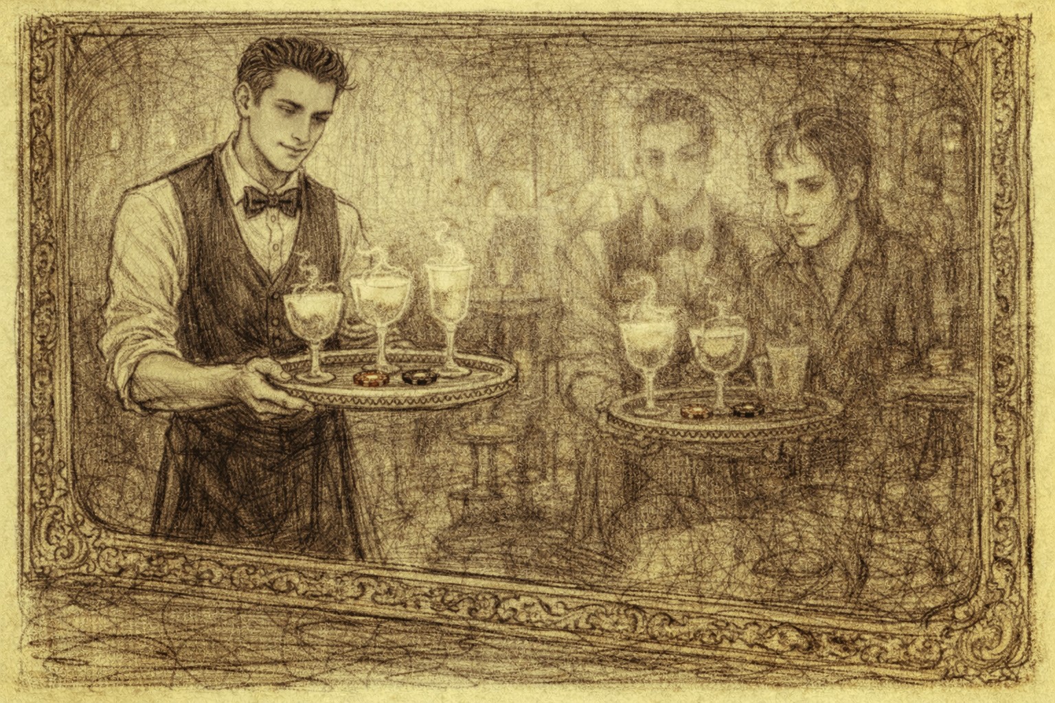
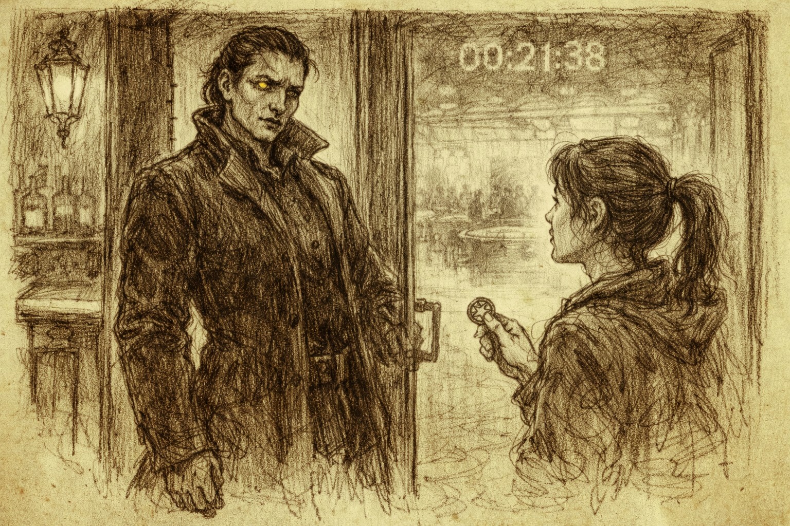
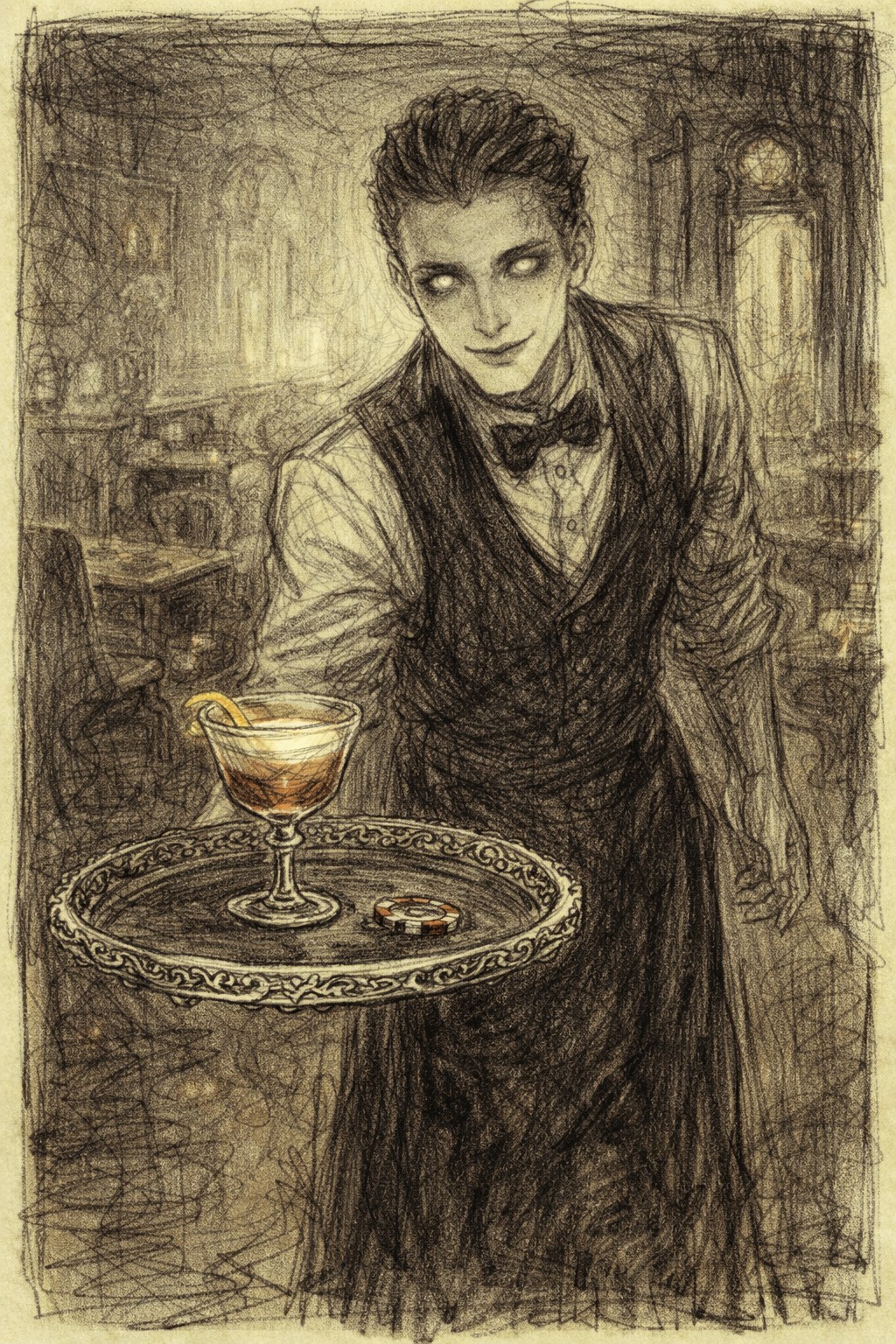
The Rhyme Project reimagines the nursery rhyme Hey Diddle Diddle as a brand‑driven hospitality concept. Drawing on the rhyme’s themes of risk, wasted time, and fleeting joy, I developed The Diddle, a premium pub and spirits brand set in a surreal, casino‑like afterlife. The brand explores time as currency and indulgence as wager, brought to life through a cohesive visual and narrative identity.
Building on this, the Negotiated Brief extends the brand into a digital context through UX/UI design. I created a website and digital assets that translate the pub’s atmosphere and storytelling into interactive experiences. This links directly to my thesis research on narrative‑driven interface design.
Over the Moon is a speculative afterlife pub brand where time, not money, is the main currency. My role was to develop the brand identity and translate its narrative into a functioning website, balancing theatrical storytelling with clear UX.
UX Approach
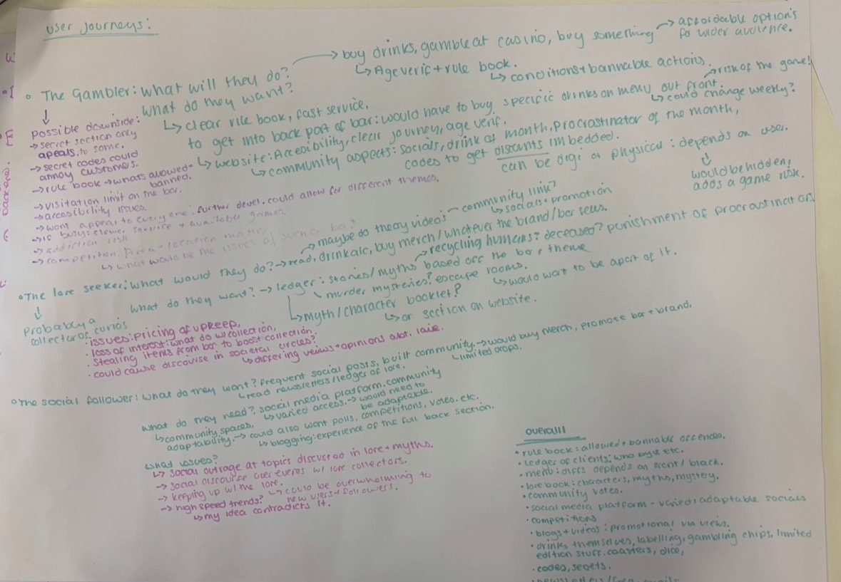
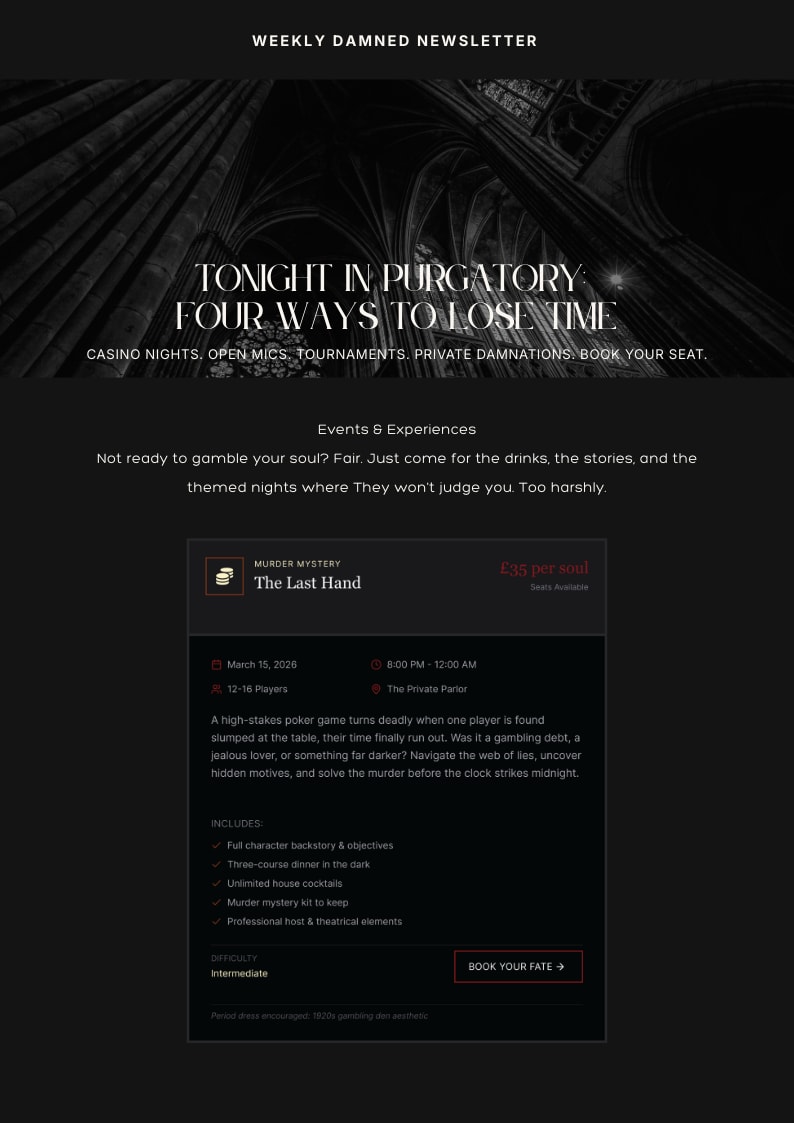
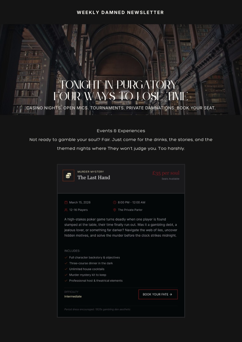
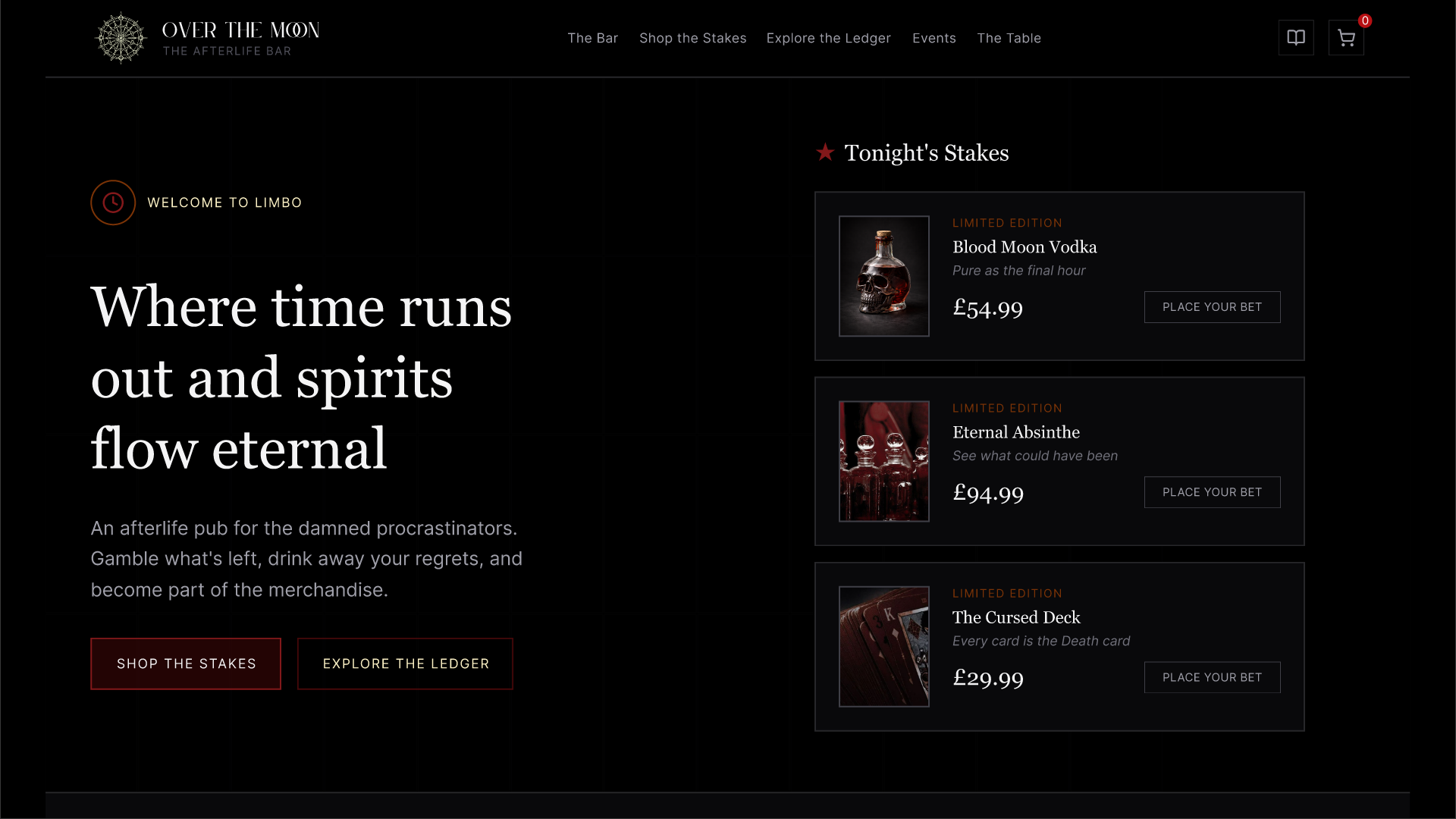
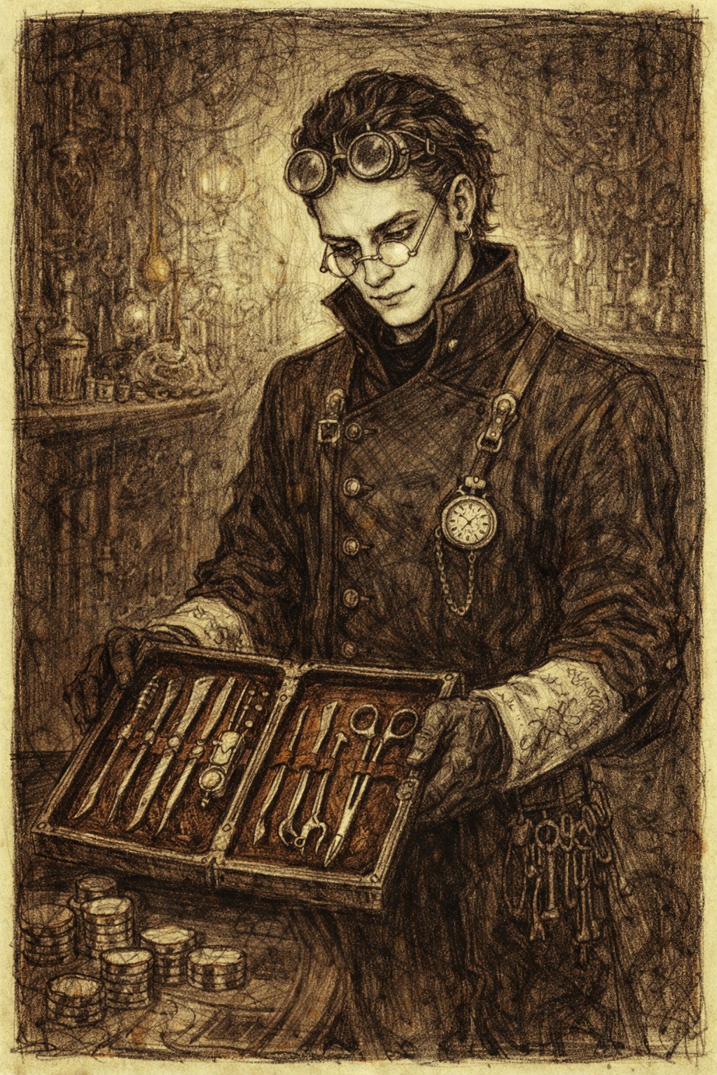
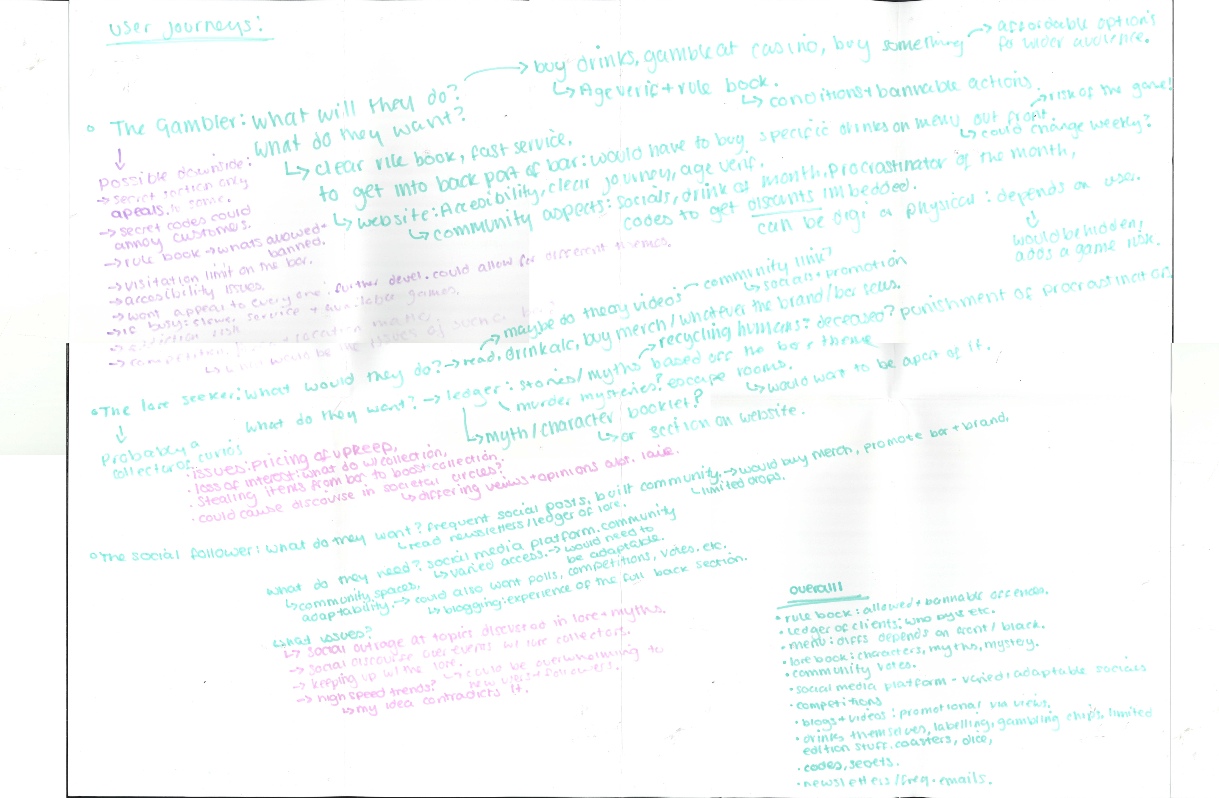
For the website, I focused on treating the experience like a ledger: visitors explore how they might spend their hours, discover stories tied to different drinks, and navigate clear sections for lore, bookings, and community events. I defined user types such as ‘Lore Seeker’ and ‘Gambler’ to frame flows and content priorities, then mapped how each would explore the site and make decisions.
User pathways were mapped to reveal how different audiences experience both the interface and the brand story.
The Gambler: Seeks quick access and a frictionless route to ordering.
The Lore Seeker: Explores rules and stories before engaging with themed products.
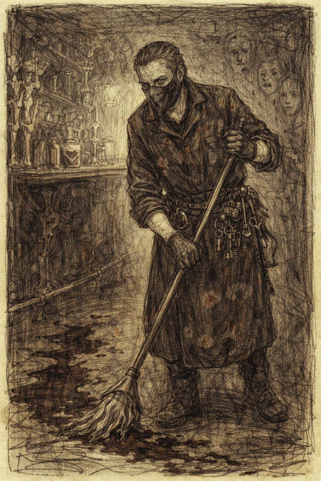
The Collector: Tracks limited‑edition artefacts and exclusive releases.
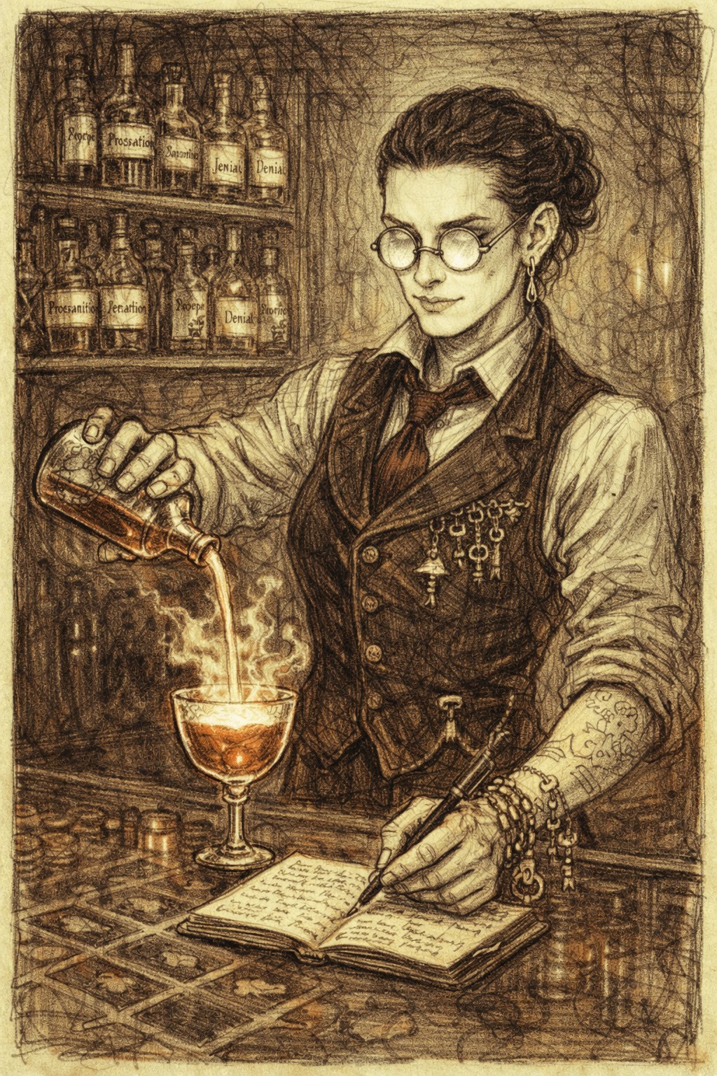
The Media Follower: Arrives through social content and is encouraged to subscribe for ongoing updates.Collectively, these journeys demonstrate how the brand’s macabre storytelling can coexist with clarity and functionality—ensuring that narrative depth enhances, rather than obscures, user experience.
Social Media Applications
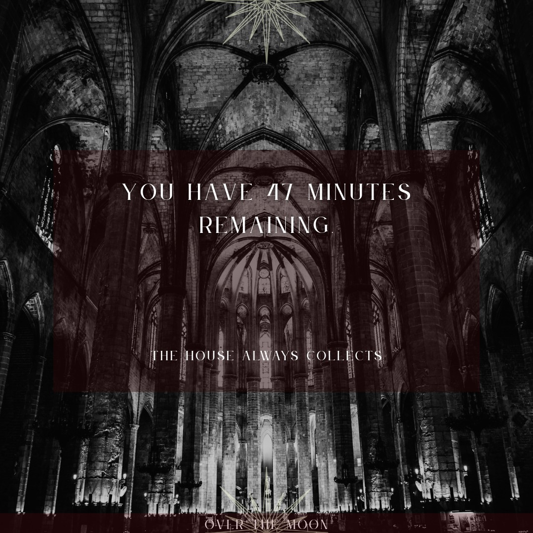
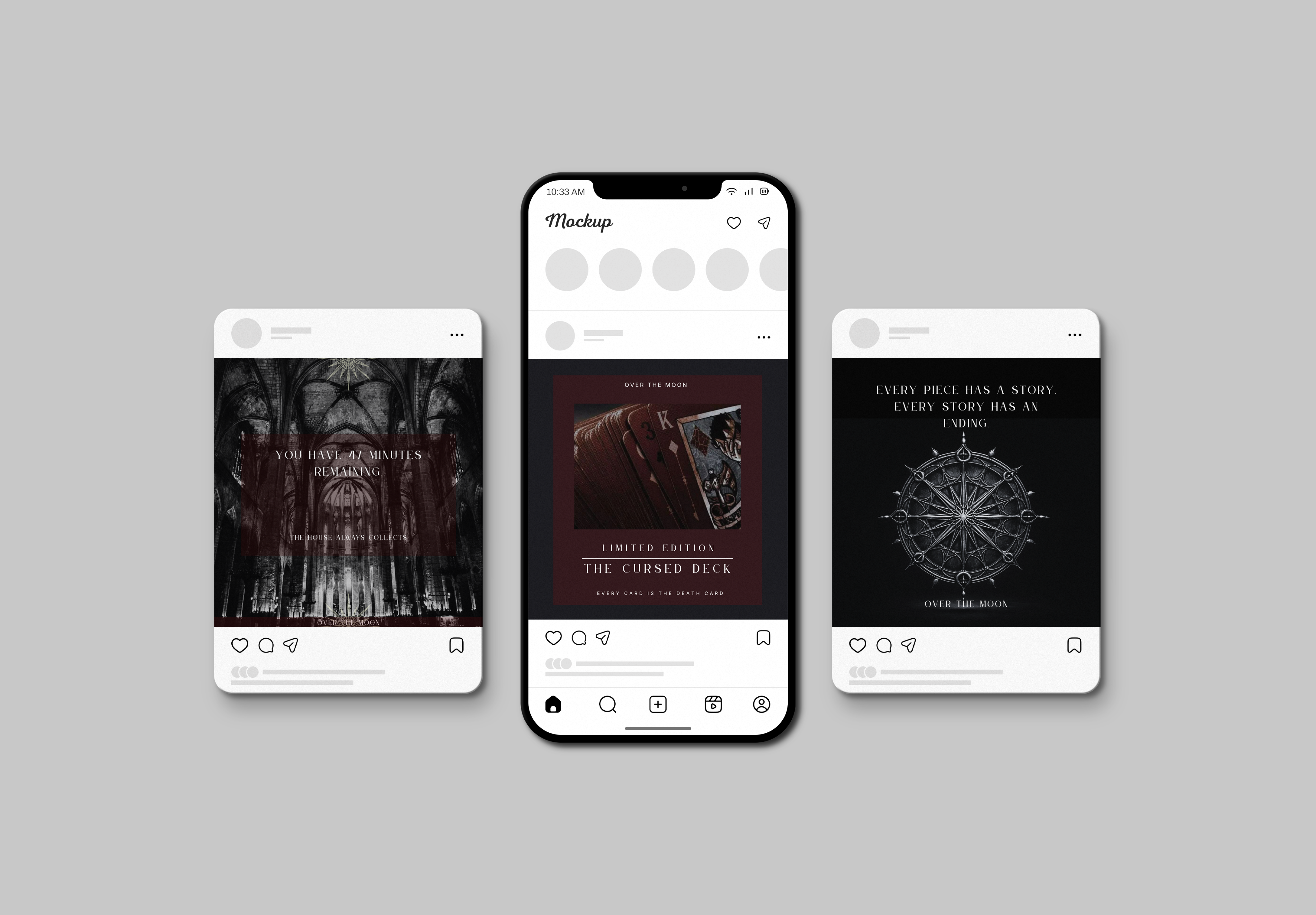
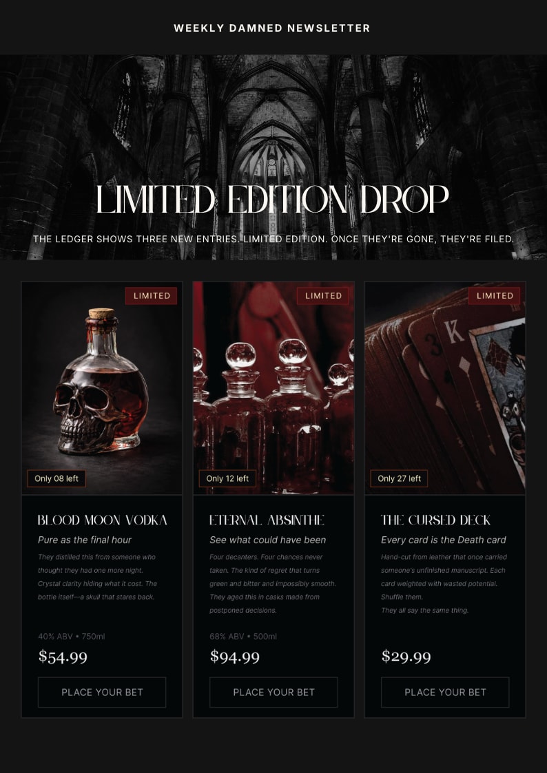
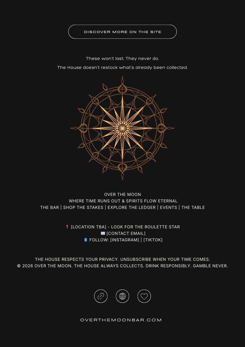
The media strategy extends Over the Moon beyond its physical venue and website into a dynamic, multi‑platform presence. Through social content and email campaigns, the brand evolves into an ongoing serial narrative—one that revisits themes of procrastination, debt, and collection. This approach ensures the story world remains active in everyday digital spaces, positioning the bar as a living mythology rather than a one‑time concept.
Developing the media suite clarified how Over the Moon can operate as an evolving narrative ecosystem rather than a fixed visual identity. The modular structure of posts and newsletters supports consistency while allowing creative variation in tone and imagery. This phase demonstrated how storytelling, pacing, and interactivity can sustain long‑term audience engagement within a branded world.
3D Applications
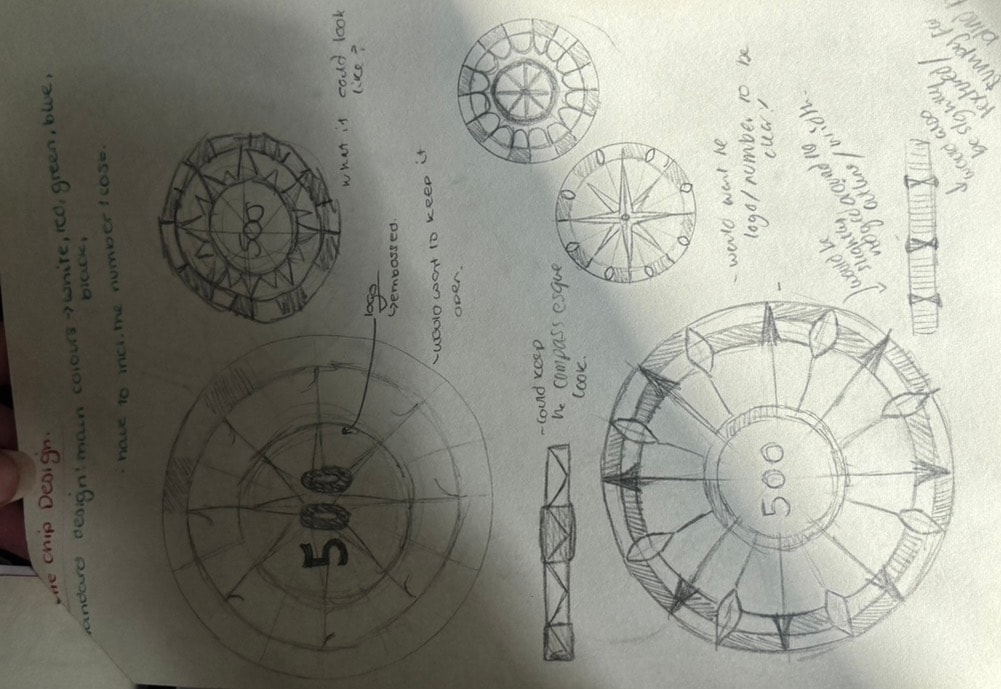
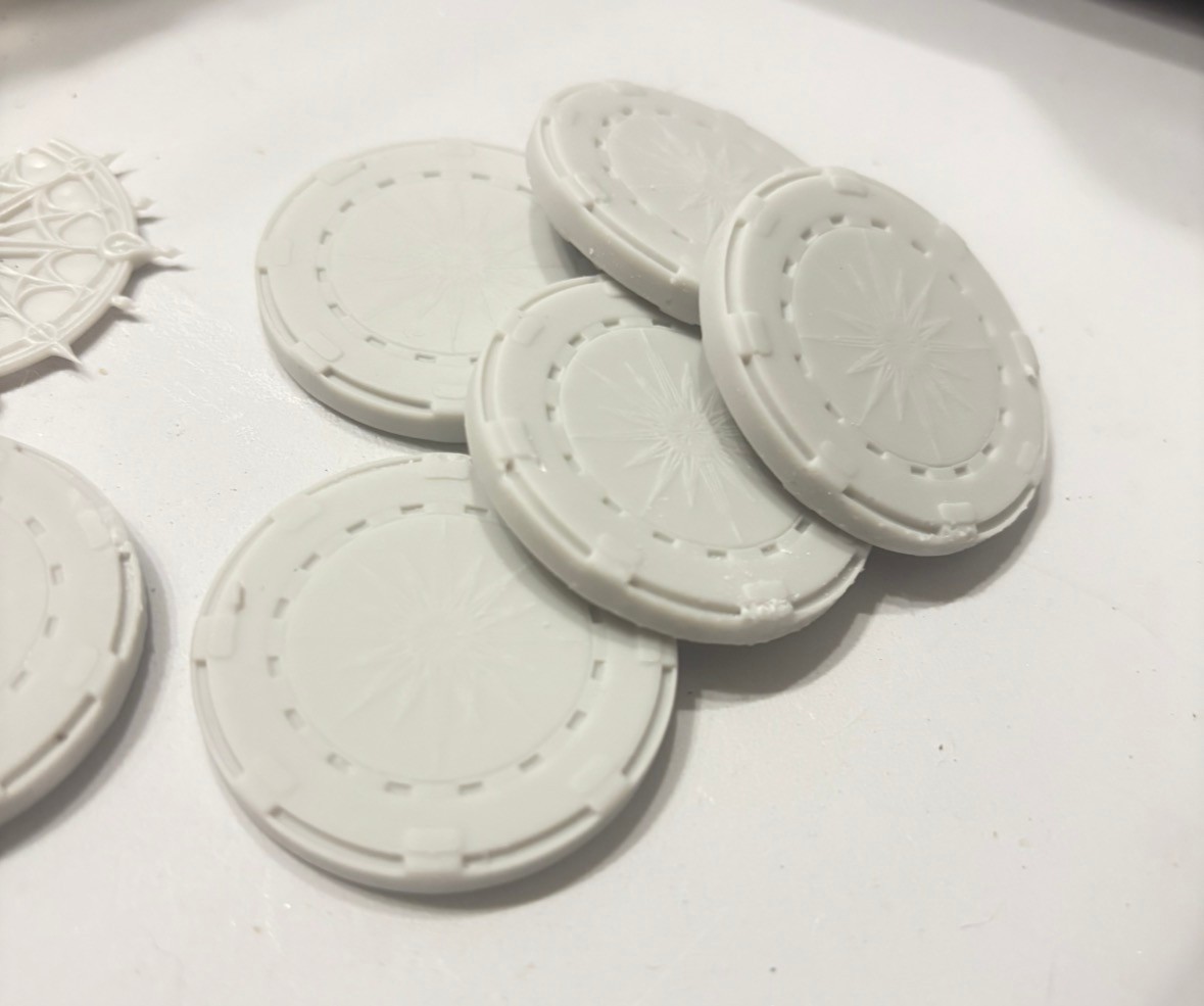
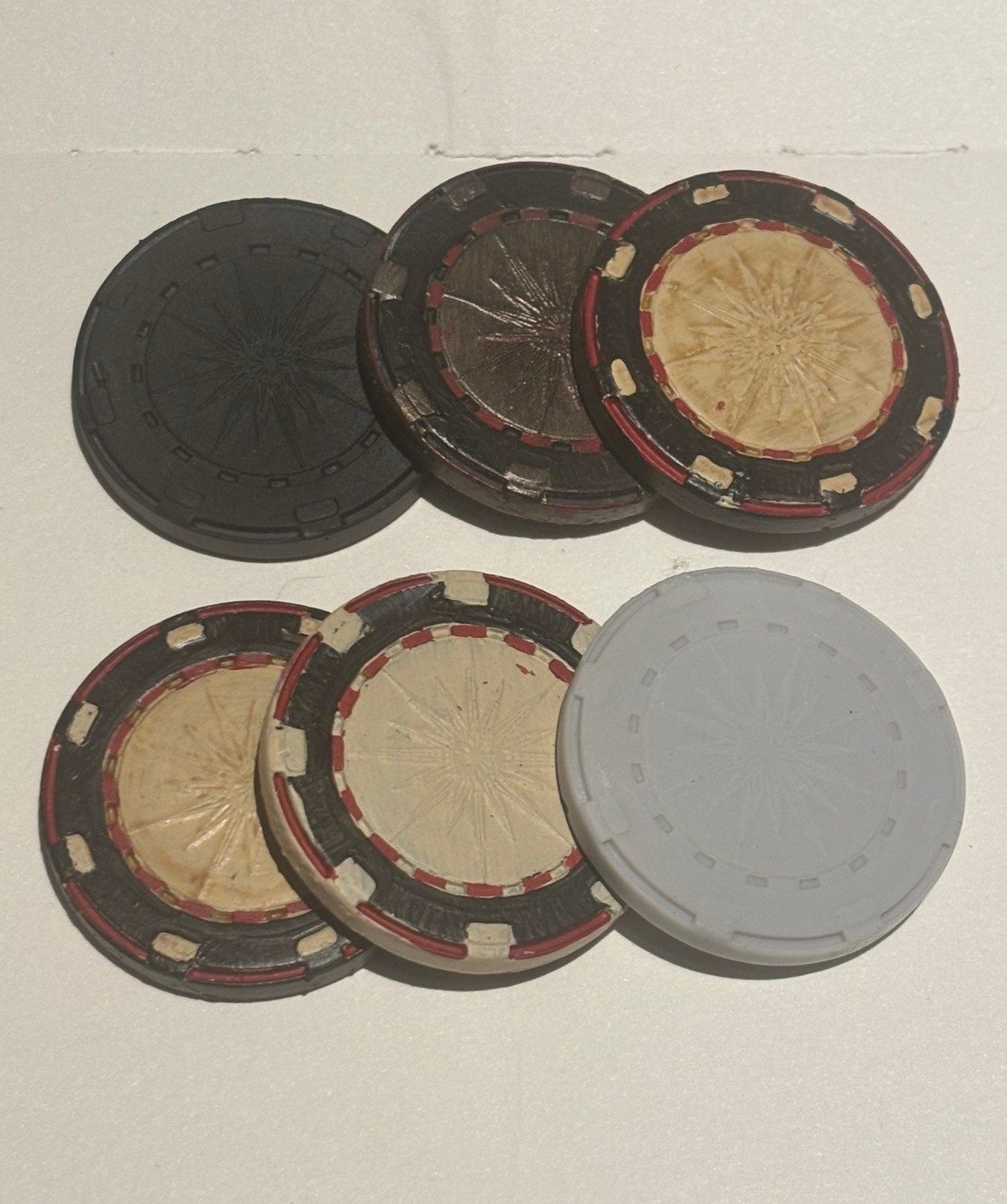
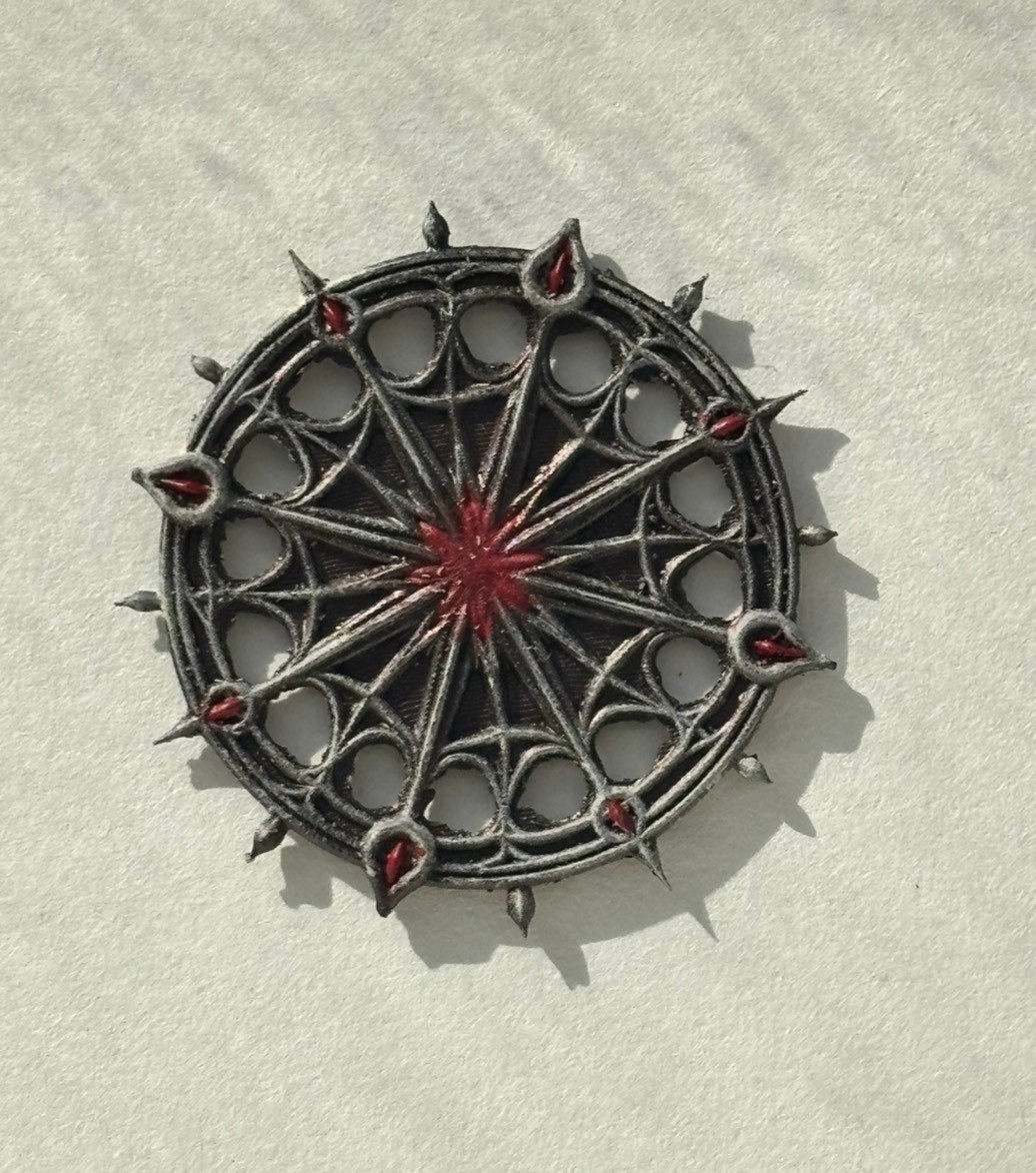
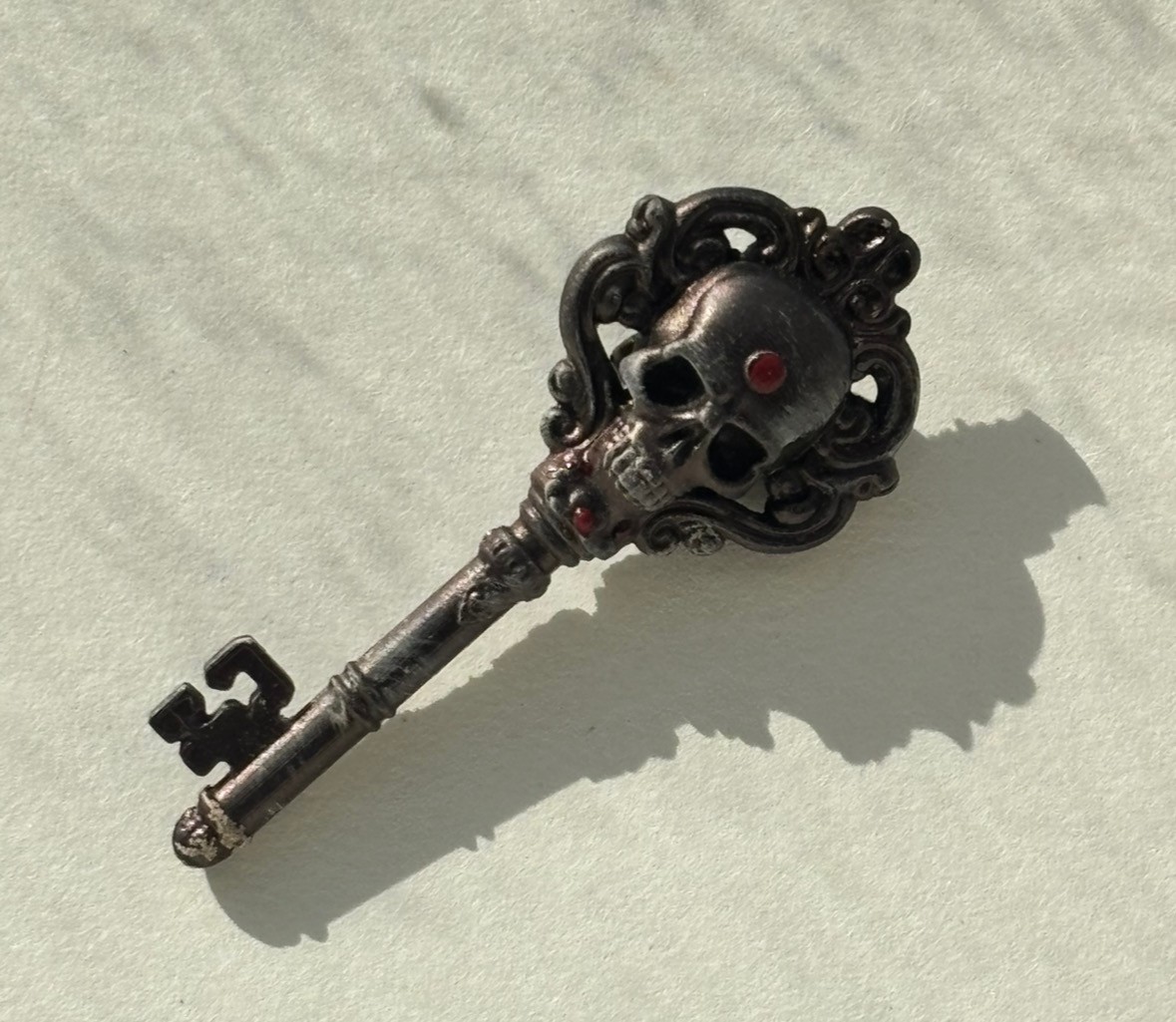
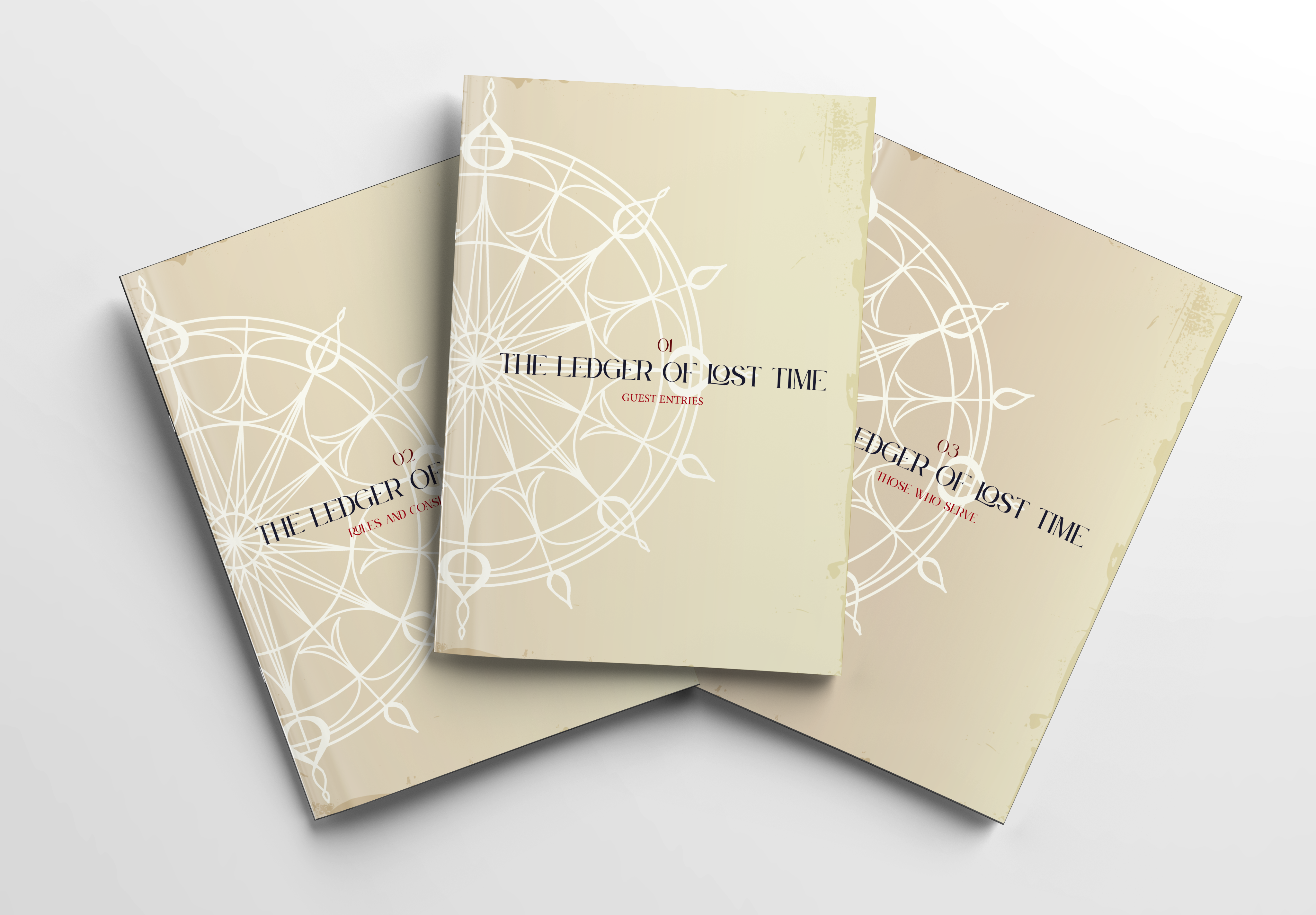
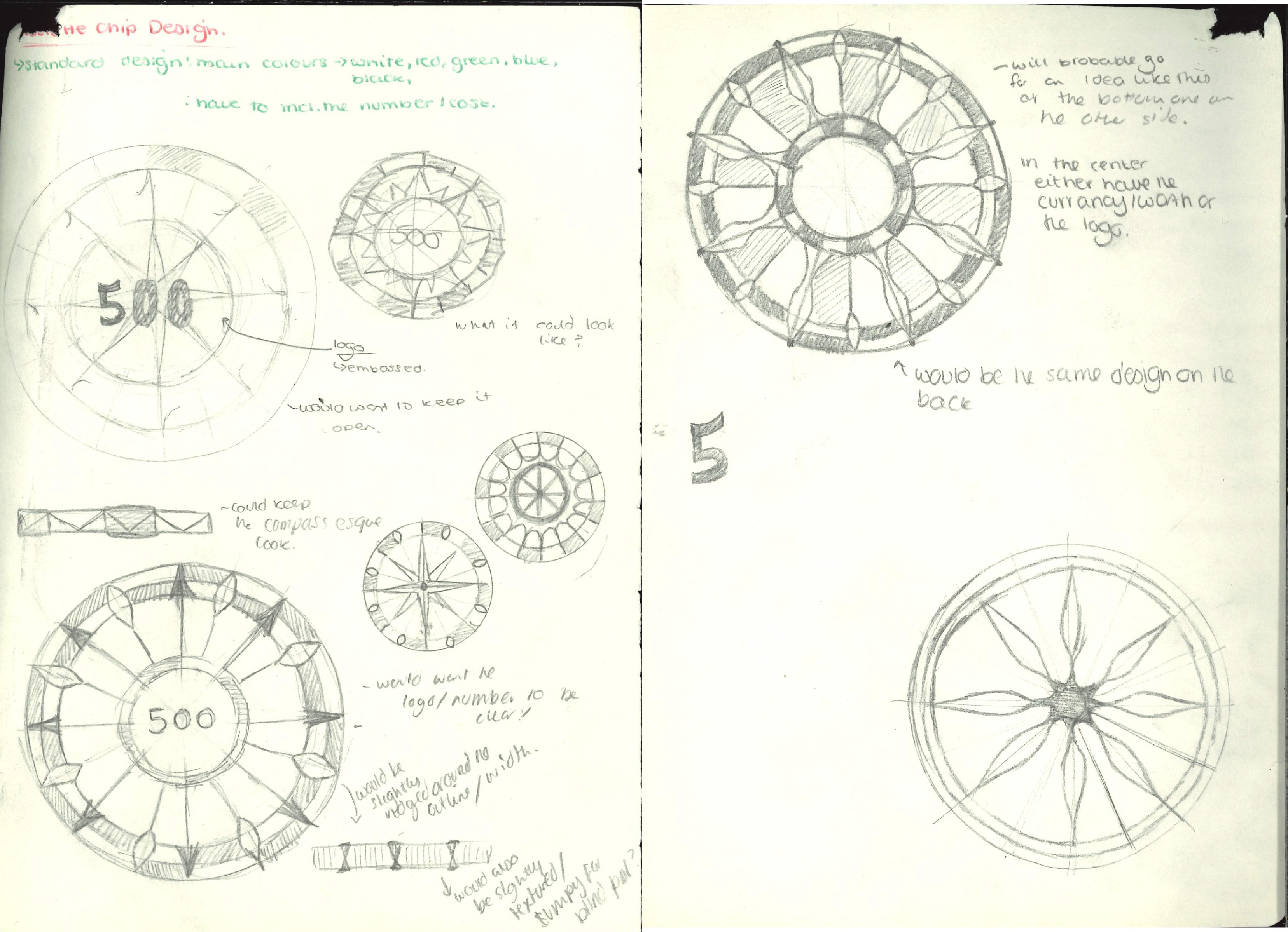
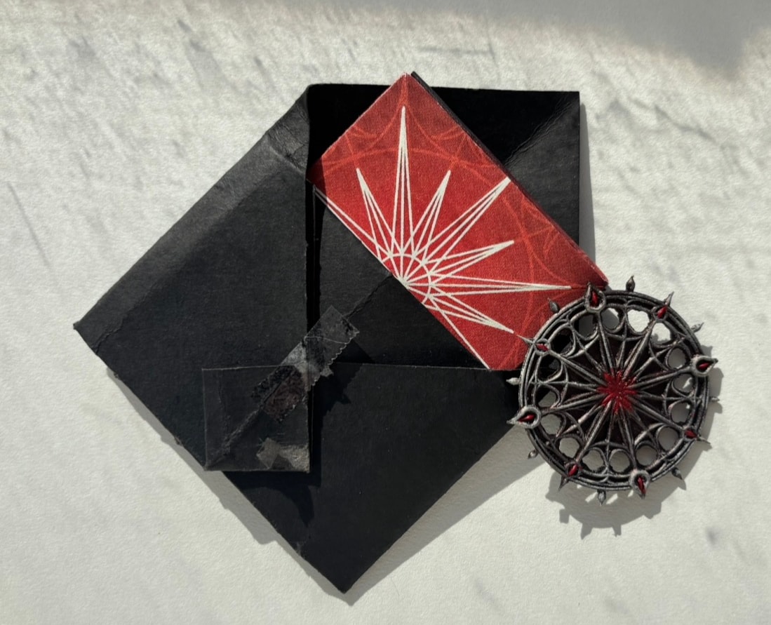
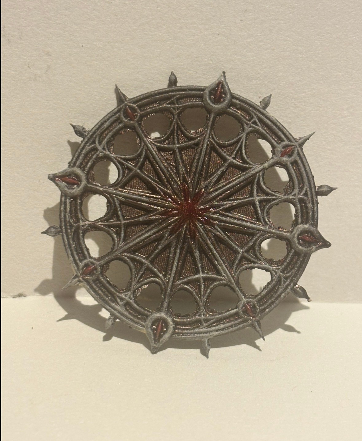
This collection translates The House’s narrative into tangible artefacts. The Ledger Trilogy, menus, and rule book ground the fiction in real‑world detail, while stickers and pins extend the sigil into everyday culture. Together these pieces established a collectible system that expands the brand into a fully realised world—where every object acts as both narrative token and mark of belonging.
Once models were prepared and exported to the resin printer’s slicing software, production followed the familiar sequence of printing, sanding, priming, painting, and sealing. Each piece varies slightly in finish, capturing the exploratory nature of this phase and forming a miniature study in iterative design. Despite early modelling challenges, the making process proved both satisfying and instructive—strengthening the link between narrative and artefact while broadening my technical skillset in 3D fabrication, a discipline now integral to my future worldbuilding practice.
Brand
Visual Identity
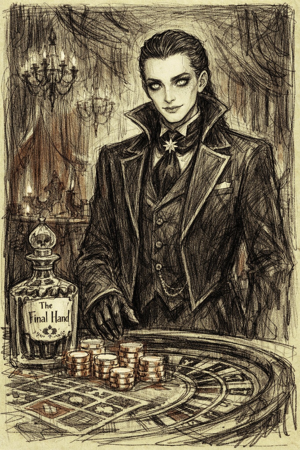
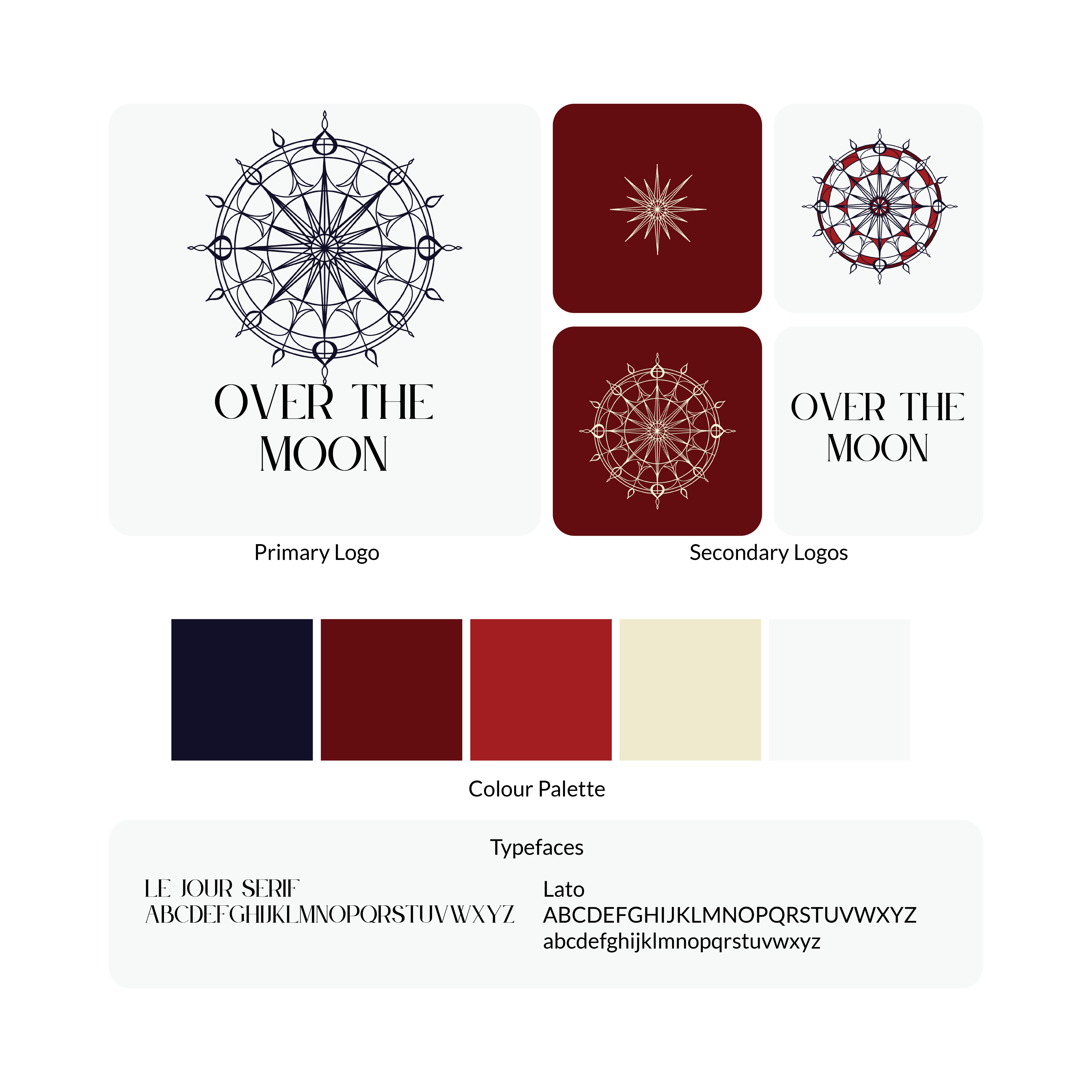
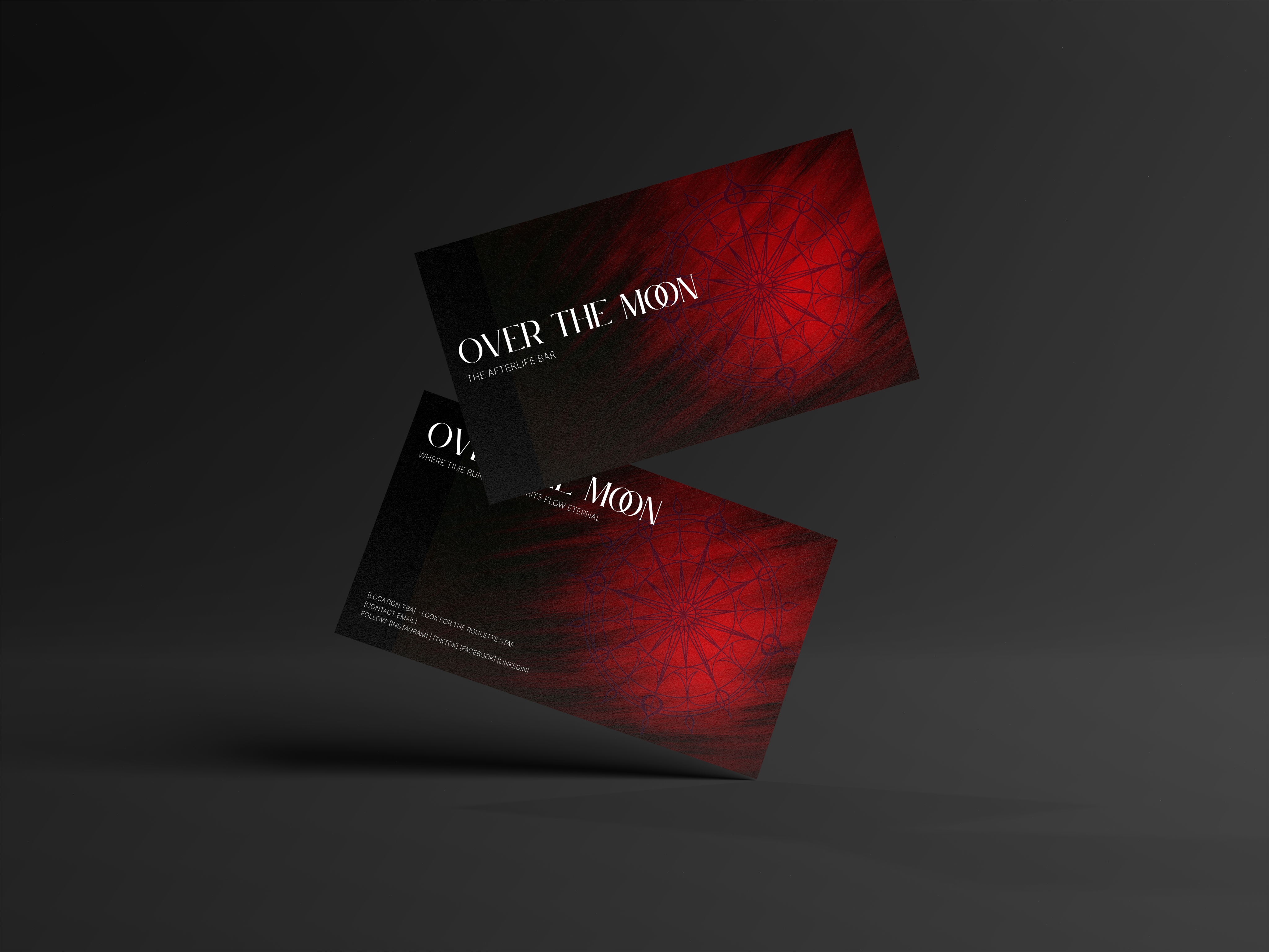
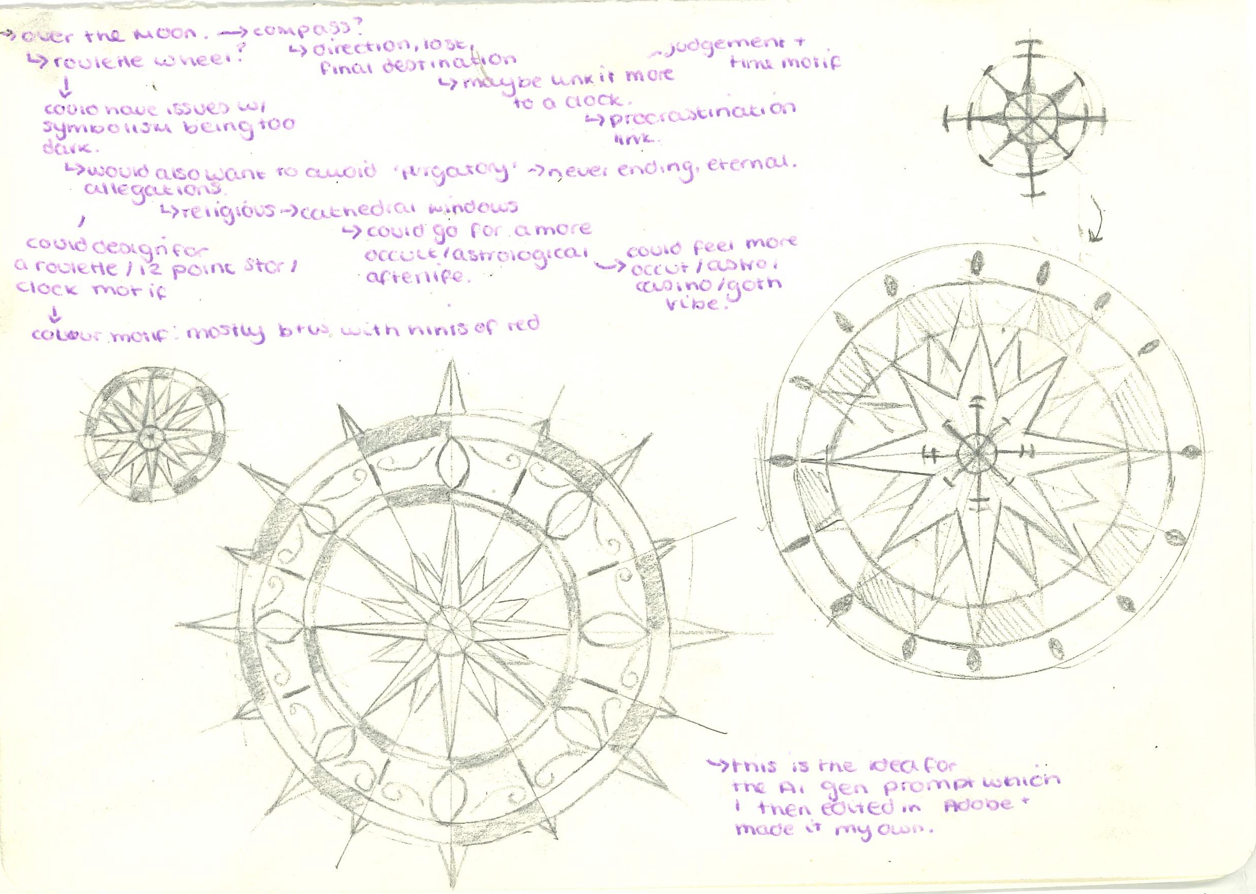
The visual identity combines celestial motifs with intimate, pub‑like warmth. A restrained palette and serif‑led typography give it a slightly literary tone, while illustrations and copy play with the tension between life, death, and everyday ritual. Brand assets cover signage, menus, drinkware, and digital touchpoints, all designed to feel like part of the same fictional universe.
Branding
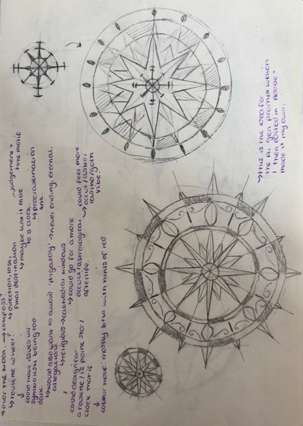
The brand identity combines a cinematic midnight navy and blood‑red palette with warm gold and cream accents to evoke a refined, nocturnal casino atmosphere. Flexible logo lock‑ups and consistent visual motifs—such as compass patterns and sigil-inspired graphics—ensure cohesion across all applications. A structured grid system and considered use of whitespace maintain clarity and balance between typography, imagery, and narrative flow.
Website Design
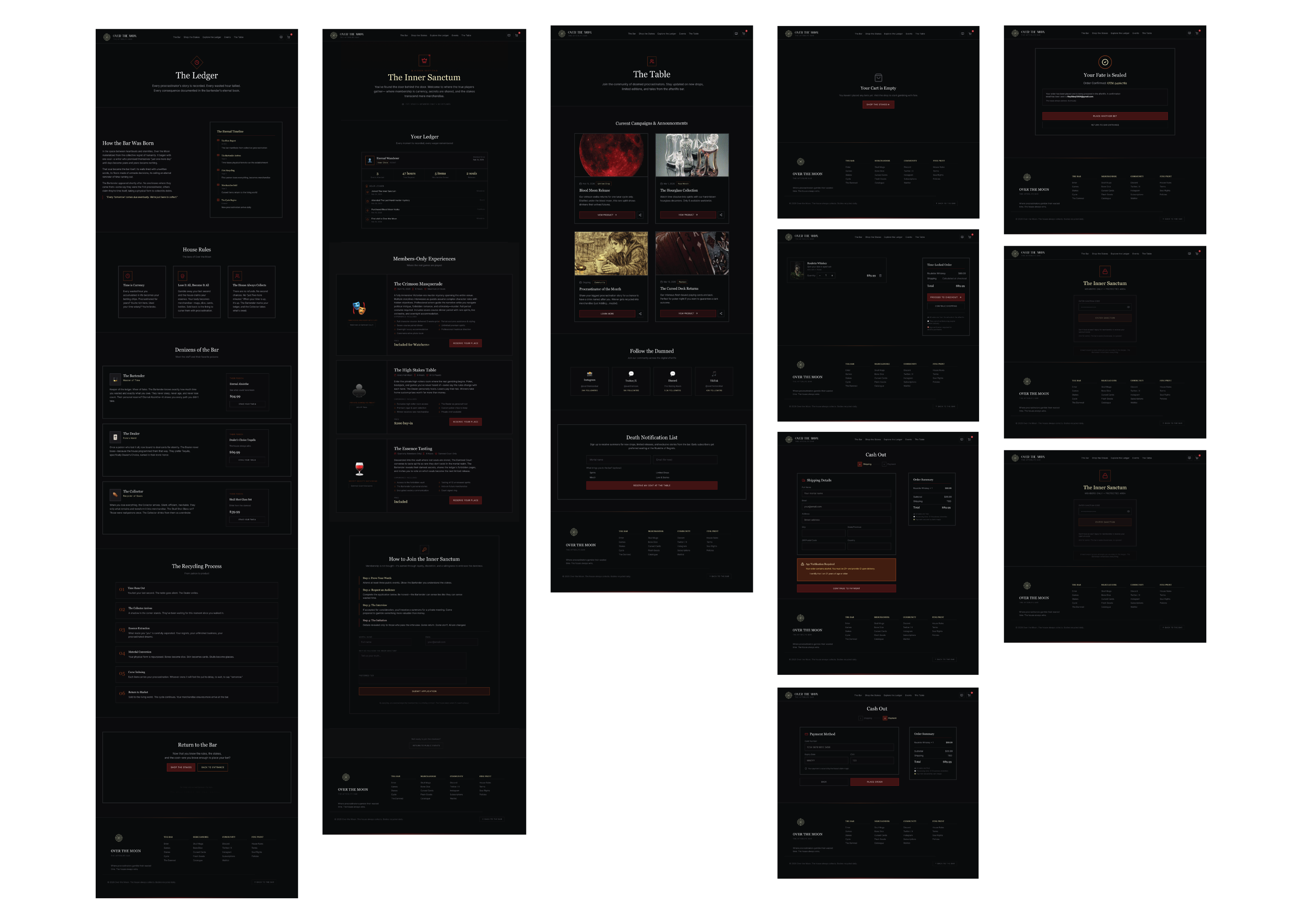
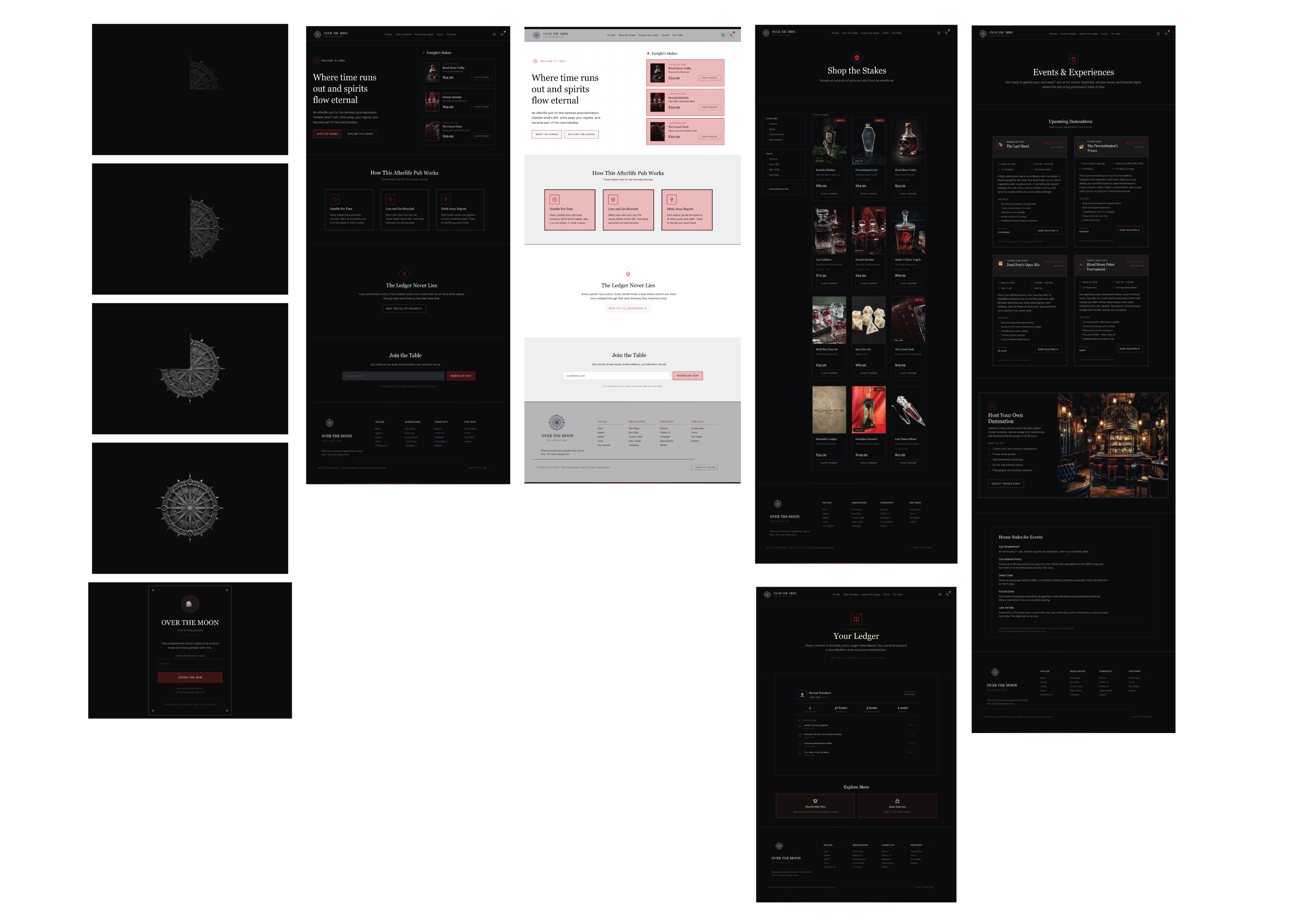
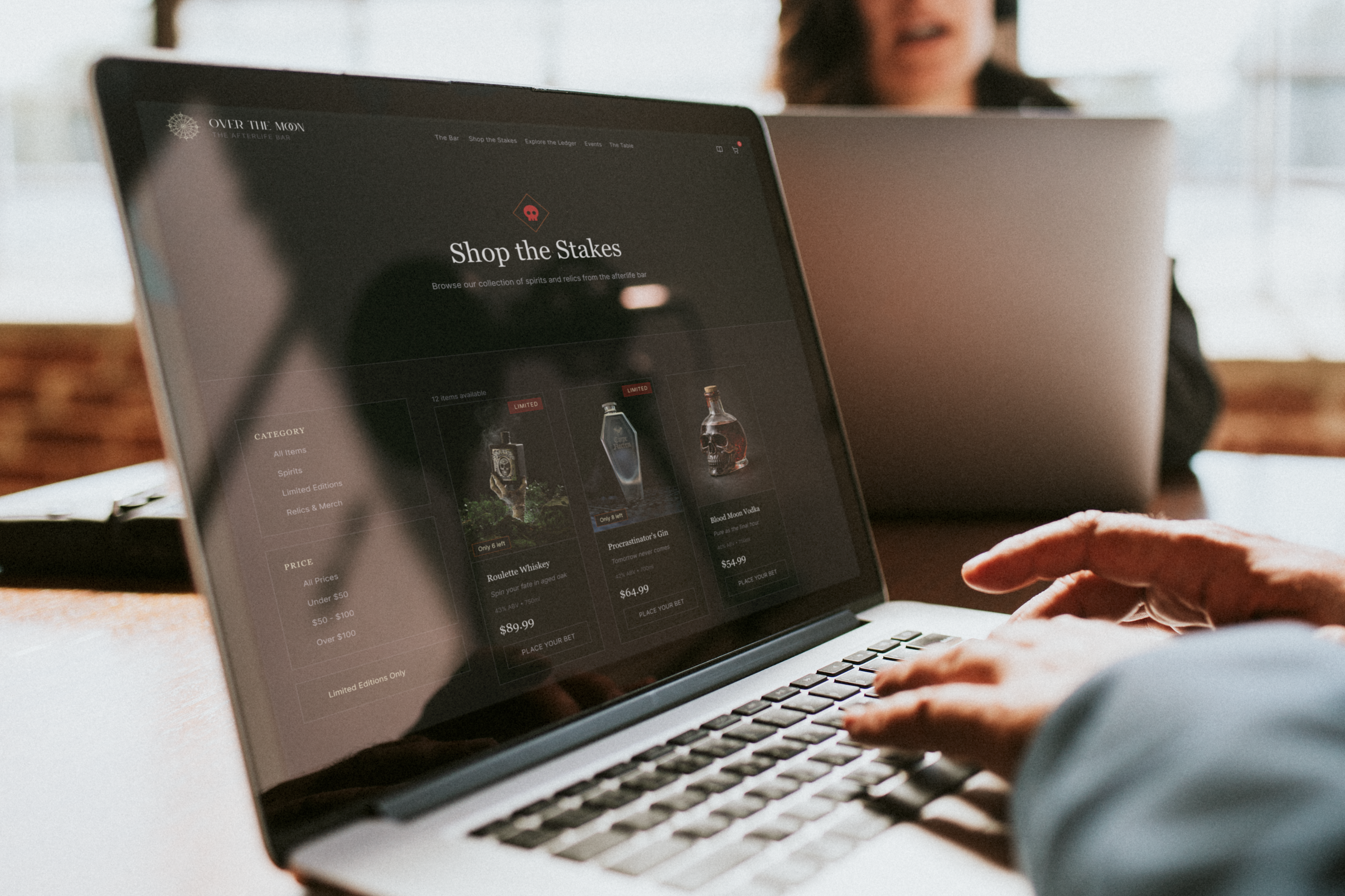
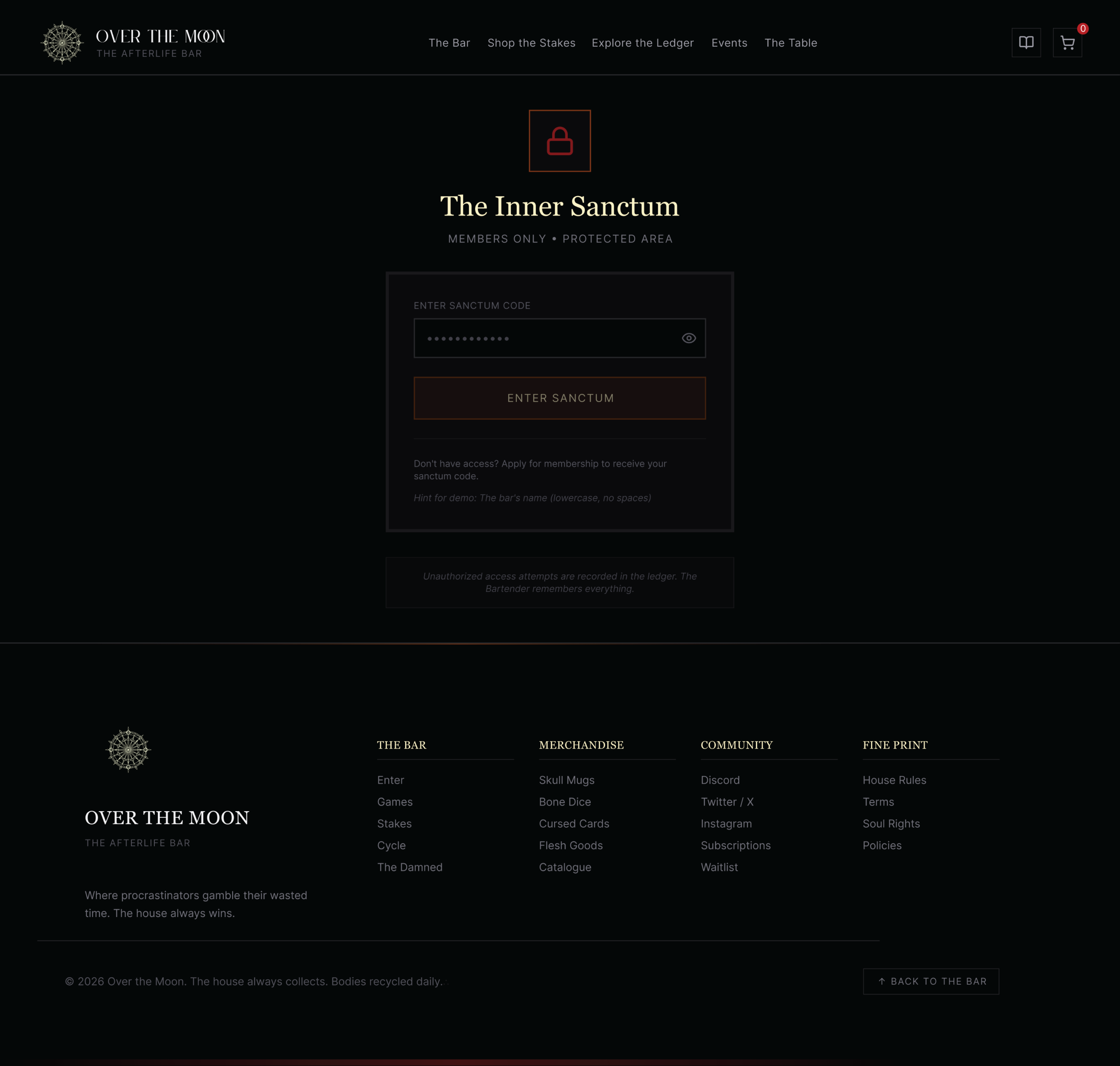
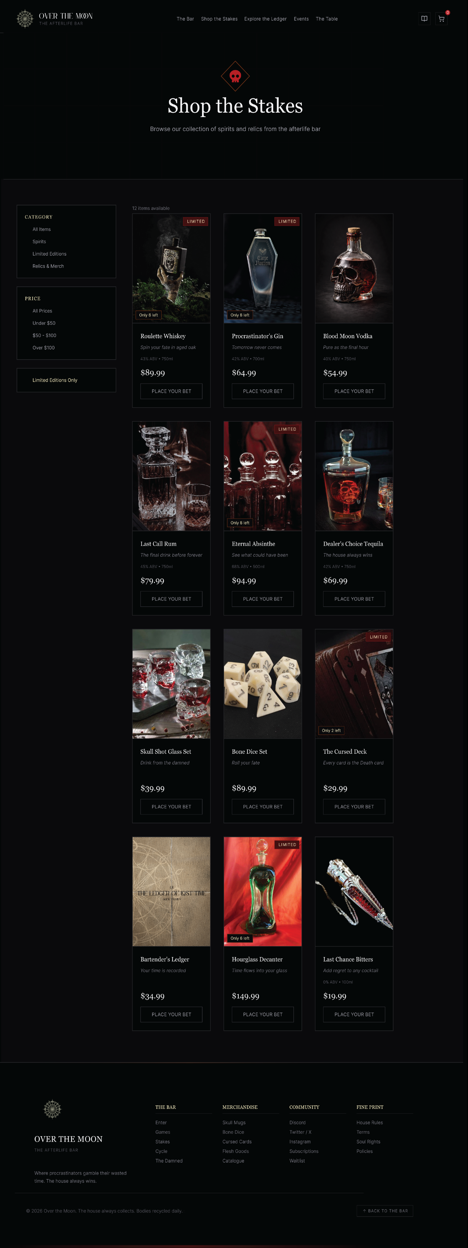
Key pages include a narrative‑led homepage, product/drink pages that combine story with practical information, and a booking flow that keeps the time currency concept visible without obscuring function. UI decisions around typography, contrast, and spacing were made to support readability while preserving the tone of voice.
The website presents its e‑commerce features—bottles, relics, and artefacts—as “exported evidence” from the bar, with each product acting as a miniature ledger entry from the House records. Subscriptions, newsletters, and event pages reinforce the in‑world idea of the House monitoring names and recurring wagers. Practical content such as age gates, legal information, and ticketing is reframed as interactive contracts within the narrative system. A modular layout supports legibility and accessibility, while components like shop filters provided opportunities to refine interaction and visual‑hierarchy design skills.
Editorial Applications
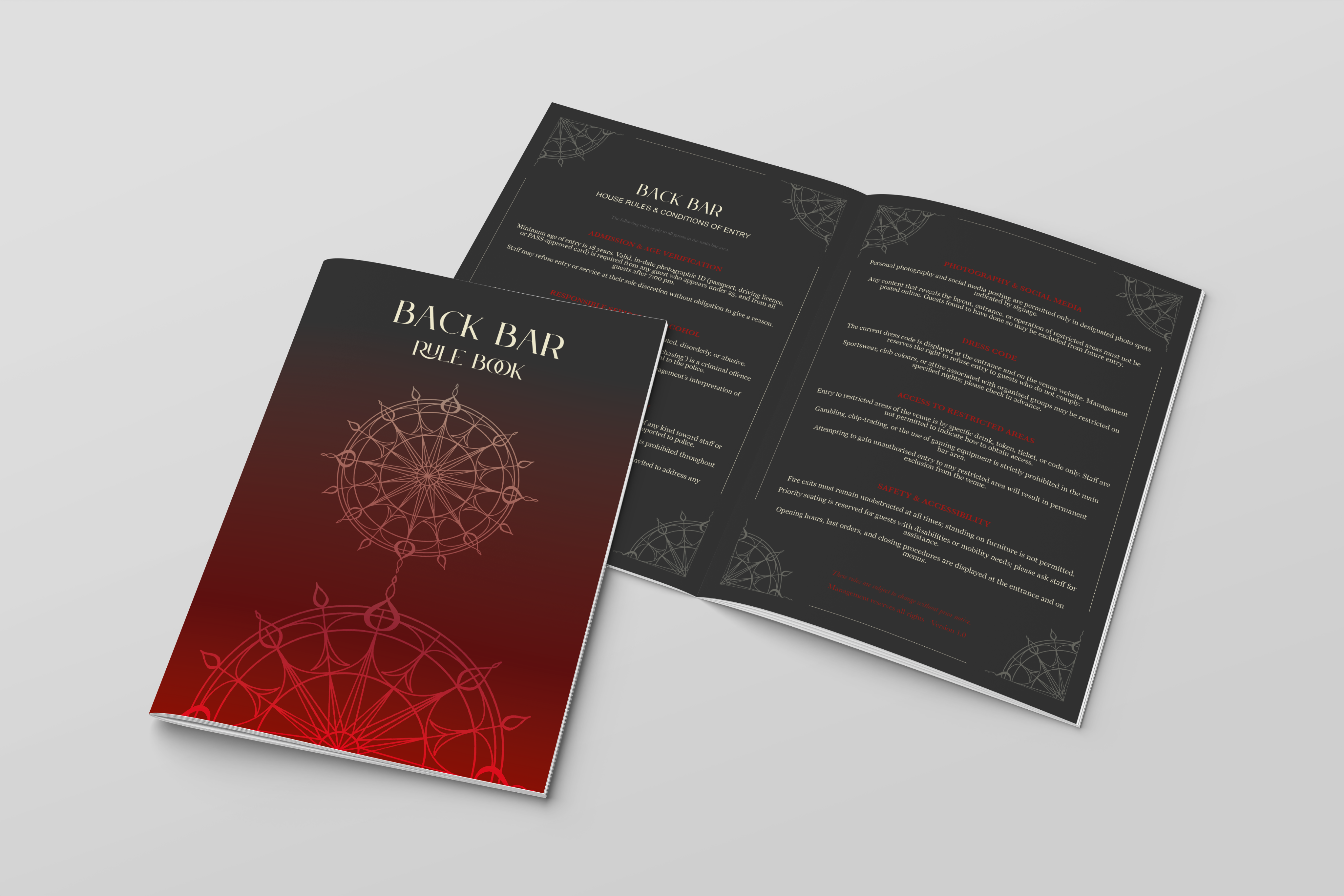
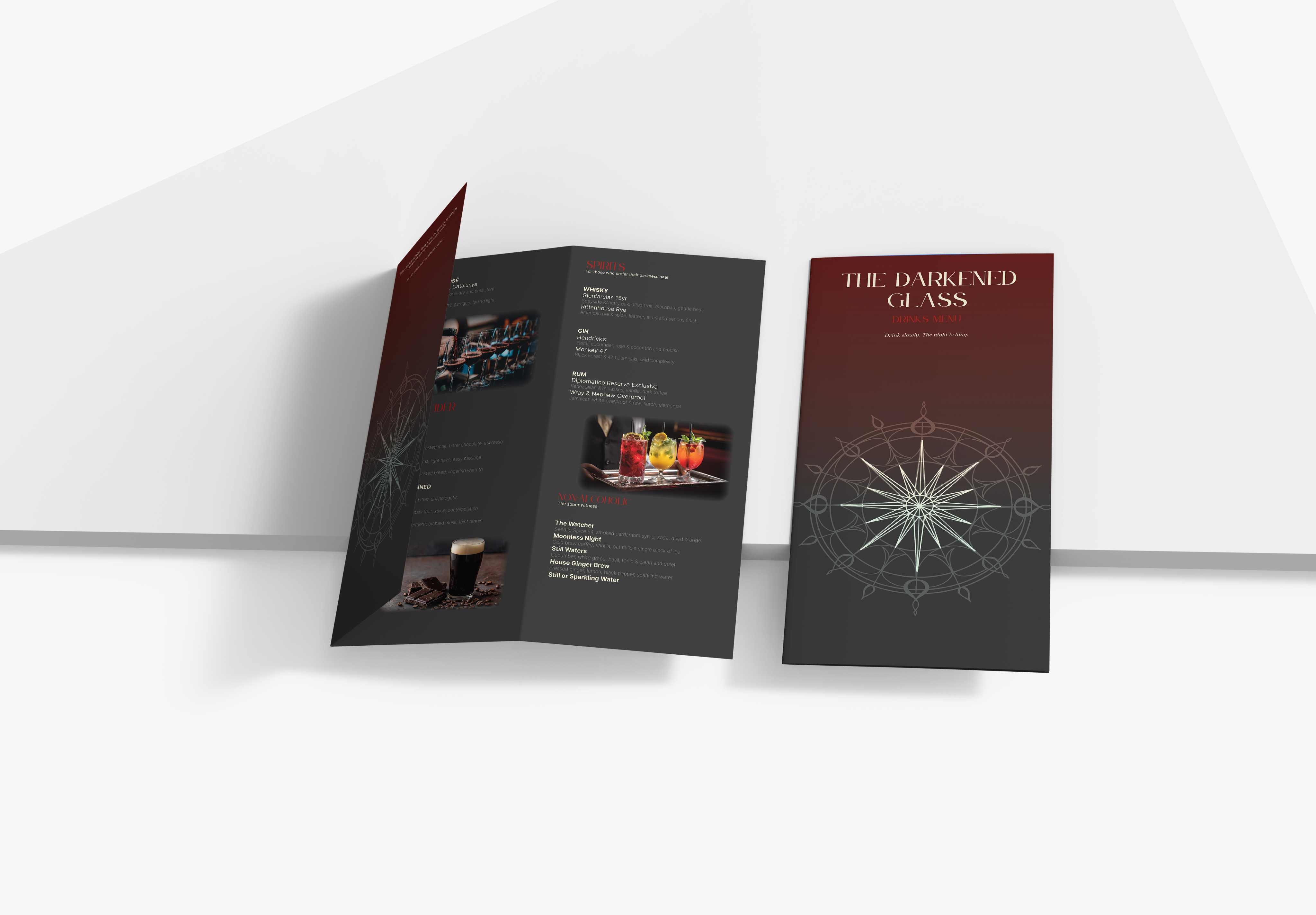
This component series expands The House through cohesive narrative design. The Rules and Menu double as functional artefacts and storytelling tools—turning each cocktail order into a symbolic wager that echoes the theme of choice and consequence.
The Lore Ledger and Character Bible root the brand’s mythology, linking drinks, artefacts, and rituals to individual histories that give every object narrative weight beyond its appearance.
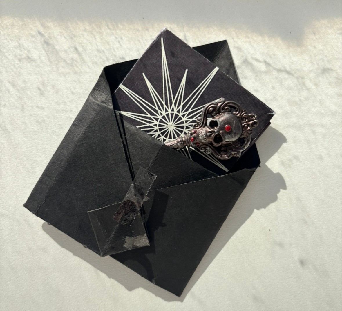
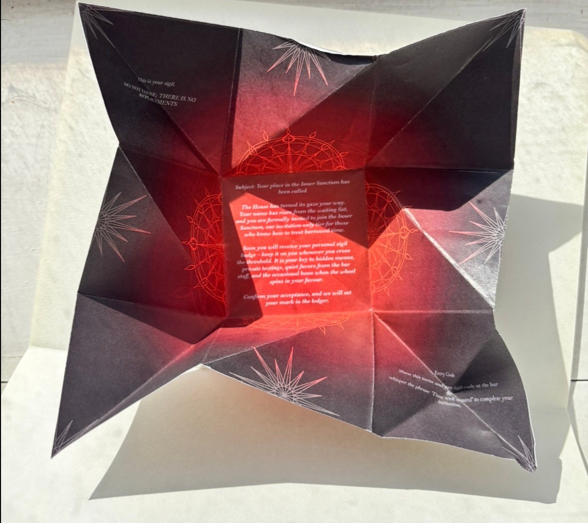
VIP communications use crests and sigils to evoke secrecy and judgment, while folded invitations—adapted from Victorian techniques—serve as tactile “keys” that unlock hidden spaces within the bar’s mythos. Iterative prototyping refined layout, scale, and finishes for a ritualistic reveal of membership.
Altogether, the system fuses theatrical storytelling with crafted materiality, immersing guests in a world where brand communication and narrative design seamlessly converge. Future developments may explore heavier stocks and bespoke envelopes to heighten tactility and collectability.
Reflection
This project showed me how far a strong narrative can carry interaction design, but also where it needs to be restrained. I learned a lot about integrating playful metaphors into a usable structure, especially around keeping navigation and calls‑to‑action unambiguous even when the theme is abstract.
Branding, UX/UI & 3D
OVER THE MOON
Over the Moon is a speculative afterlife pub brand where time, not money, is the main currency. My role was to develop the brand identity and translate its narrative into a functioning website, balancing theatrical storytelling with clear UX.
Overview
The Rhyme Project reimagines the nursery rhyme Hey Diddle Diddle as a brand‑driven hospitality concept. Drawing on the rhyme’s themes of risk, wasted time, and fleeting joy, I developed The Diddle, a premium pub and spirits brand set in a surreal, casino‑like afterlife. The brand explores time as currency and indulgence as wager, brought to life through a cohesive visual and narrative identity.
Building on this, the Negotiated Brief extends the brand into a digital context through UX/UI design. I created a website and digital assets that translate the pub’s atmosphere and storytelling into interactive experiences. This links directly to my thesis research on narrative‑driven interface design.
Over the Moon is a speculative afterlife pub brand where time, not money, is the main currency. My role was to develop the brand identity and translate its narrative into a functioning website, balancing theatrical storytelling with clear UX.
Brand
The visual identity combines celestial motifs with intimate, pub‑like warmth. A restrained palette and serif‑led typography give it a slightly literary tone, while illustrations and copy play with the tension between life, death, and everyday ritual. Brand assets cover signage, menus, drinkware, and digital touchpoints, all designed to feel like part of the same fictional universe.
Visual Identity
The brand identity combines a cinematic midnight navy and blood‑red palette with warm gold and cream accents to evoke a refined, nocturnal casino atmosphere. Flexible logo lock‑ups and consistent visual motifs—such as compass patterns and sigil-inspired graphics—ensure cohesion across all applications. A structured grid system and considered use of whitespace maintain clarity and balance between typography, imagery, and narrative flow.
Branding

UX Approach
For the website, I focused on treating the experience like a ledger: visitors explore how they might spend their hours, discover stories tied to different drinks, and navigate clear sections for lore, bookings, and community events. I defined user types such as ‘Lore Seeker’ and ‘Gambler’ to frame flows and content priorities, then mapped how each would explore the site and make decisions.
User pathways were mapped to reveal how different audiences experience both the interface and the brand story.
- The Gambler: Seeks quick access and a frictionless route to ordering.
- The Lore Seeker: Explores rules and stories before engaging with themed products.
- The Collector: Tracks limited‑edition artefacts and exclusive releases.
- The Media Follower: Arrives through social content and is encouraged to subscribe for ongoing updates.Collectively, these journeys demonstrate how the brand’s macabre storytelling can coexist with clarity and functionality—ensuring that narrative depth enhances, rather than obscures, user experience.
Website Design
Key pages include a narrative‑led homepage, product/drink pages that combine story with practical information, and a booking flow that keeps the time currency concept visible without obscuring function. UI decisions around typography, contrast, and spacing were made to support readability while preserving the tone of voice.
The website presents its e‑commerce features—bottles, relics, and artefacts—as “exported evidence” from the bar, with each product acting as a miniature ledger entry from the House records. Subscriptions, newsletters, and event pages reinforce the in‑world idea of the House monitoring names and recurring wagers. Practical content such as age gates, legal information, and ticketing is reframed as interactive contracts within the narrative system. A modular layout supports legibility and accessibility, while components like shop filters provided opportunities to refine interaction and visual‑hierarchy design skills.
Social Media Applications
The media strategy extends Over the Moon beyond its physical venue and website into a dynamic, multi‑platform presence. Through social content and email campaigns, the brand evolves into an ongoing serial narrative—one that revisits themes of procrastination, debt, and collection. This approach ensures the story world remains active in everyday digital spaces, positioning the bar as a living mythology rather than a one‑time concept.
Developing the media suite clarified how Over the Moon can operate as an evolving narrative ecosystem rather than a fixed visual identity. The modular structure of posts and newsletters supports consistency while allowing creative variation in tone and imagery. This phase demonstrated how storytelling, pacing, and interactivity can sustain long‑term audience engagement within a branded world.
Editorial Applications
This component series expands The House through cohesive narrative design. The Rules and Menu double as functional artefacts and storytelling tools—turning each cocktail order into a symbolic wager that echoes the theme of choice and consequence.
The Lore Ledger and Character Bible root the brand’s mythology, linking drinks, artefacts, and rituals to individual histories that give every object narrative weight beyond its appearance.
VIP communications use crests and sigils to evoke secrecy and judgment, while folded invitations—adapted from Victorian techniques—serve as tactile “keys” that unlock hidden spaces within the bar’s mythos. Iterative prototyping refined layout, scale, and finishes for a ritualistic reveal of membership.
Altogether, the system fuses theatrical storytelling with crafted materiality, immersing guests in a world where brand communication and narrative design seamlessly converge. Future developments may explore heavier stocks and bespoke envelopes to heighten tactility and collectability.
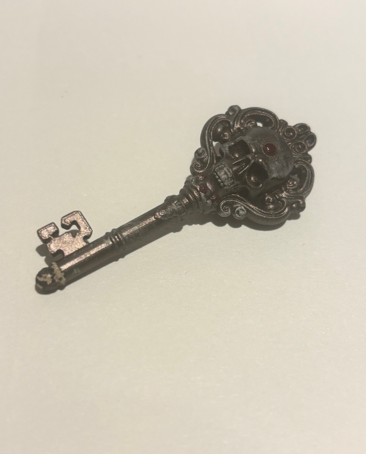
3D Applications
This collection translates The House’s narrative into tangible artefacts. The Ledger Trilogy, menus, and rule book ground the fiction in real‑world detail, while stickers and pins extend the sigil into everyday culture. Together these pieces established a collectible system that expands the brand into a fully realised world—where every object acts as both narrative token and mark of belonging.
Once models were prepared and exported to the resin printer’s slicing software, production followed the familiar sequence of printing, sanding, priming, painting, and sealing. Each piece varies slightly in finish, capturing the exploratory nature of this phase and forming a miniature study in iterative design. Despite early modelling challenges, the making process proved both satisfying and instructive—strengthening the link between narrative and artefact while broadening my technical skillset in 3D fabrication, a discipline now integral to my future worldbuilding practice.
Reflection
This project showed me how far a strong narrative can carry interaction design, but also where it needs to be restrained. I learned a lot about integrating playful metaphors into a usable structure, especially around keeping navigation and calls‑to‑action unambiguous even when the theme is abstract.